Chart Building Guide for Envision
Guidelines for designing charts in Envision.
Note: This document provides information to help you make design decisions for using Envision. For step-by-step instructions for creating the charts, see Creating a Chart.
Supported Envision Versions: 2020.1.1
On this page:
- Overview
- Choosing a Time Interval
- Selecting your Data Grouping
- Selecting Filters
- Choosing the Chart Visualization
- Examples
Overview
With Envision, you can create many different charts that help visualize critical business data. With all of the possible configurations, it could be difficult to know where to start with designing charts. This guide helps explain common scenarios and best practices to build informative high-performance charts, including:
- Time series data with drill-down
- Multiple chart overlays
- User-adjustable filters
Choosing a Time Interval
The first choices you must make when designing a chart determine these two key factors:
- Where the data comes from (dataset).
- The time interval/window you want to use.
When deciding the time interval, think about the level of granularity you need in your statistics. This time interval granularity is a critical part of the performance of a chart. A finer the level of granularity, as represented by a smaller time interval (for example, minutes) means that more data must be searched over a time period. For example, of course, a one-day period represented with a time interval of hours has 24 data points; the same time period, with a time interval of minutes, has 1440 data points.
Envision empowers users with the ability to view business data over large time periods rapidly using coarse-grained granularity (for example, years or months), while enabling drill-down into finer granularity to see trends over weeks, days, hours, and/or minutes.
For instructions on determining the time interval in a chart, see Creating a Chart.
Pro Tip: Start your charts with a coarse granular time interval: Year or Month. Then define drill-down to Week and further drill-down charts for Days, Hours, and Minutes, as necessary.
Selecting your Data Grouping
After choosing your dataset and time interval, the next step is to select the data grouping. In the data grouping, you specify the dimensions that your chart is visualizing. This data grouping is tightly coupled with the chart visualization you're building.
Grouping is an important concept to understand when building charts. The more dimensions you select in your grouping, the more unique data points you'll be looking at. It's important to choose a chart type that can provide a useful visualization of the chosen grouping.
Example
Let's say you want to design a chart that shows Product Segment Sales against each other over time. You could choose these values:
- Group By: Product Segment, Timestamp
- Chart Type: Bar Chart
- Series Accumulator: Sales Subtotal, SUM
You would not want to use this grouping with a Pie Chart, because the visualization will include too many data points to visualize in a pie chart. If you want a pie chart, you might answer the question slightly differently:
- Group By: Product Segment
- Filter: Last Year
- Chart Type: Pie Chart
- Series Accumulator: Sales Subtotal, SUM
Selecting Filters
The next option for your chart is a set of data filters. In addition, every chart has at least one filter, on timestamp. A timestamp filter helps focus the data on what is relevant to the user, and influences the performance of the chart. It is best to always keep the timestamp filter that deterministically defines a time range of data that will be visualized.
For example, if you want to show a sales trend over the last week, a timestamp filter applied as the 1 week to the current date will ensure the chart always (deterministically) displays the most recent 7 days of sales data.
Pro Tip: Filter by timestamp over a time period that is less than the next aggregation. For example, if you're looking at Month time intervals, filter over the most recent 12 months. If you want to look at more than a year's worth of data, step up to a Year time interval. If you need to see more detailed information over specific time periods, just define additional charts to enable drill-down to week, day, hour, and minute time intervals.
In addition to the timestamp filter, you can use additional filters to focus on specific dimensions. This is useful for many scenarios; for example, visualizing the sales trends of a specific product, rather than of all products together.
Choosing the Chart Visualization
Chart types allow you to visualize data in a way that makes the most sense to you. You can easily experiment with different chart types to get the exact look you need to communicate the data effectively. Consider:
Drilldown
Within the chart selection, you'll also notice the drill-down form element this guide mentions regularly. This is how you define where the chart goes if a user clicks on a chart data element. You will use this often to define charts that enable users to drill down into specific data points.
Pro Tip: Finish building your high-level chart before playing around with the drilldown options. You'll need to build a second chart for the drilldown to load, and it's best to finish working with the high-level chart before building the drilldown chart.
X-Axis
The X-axis configuration is defined for some chart types, but is not applicable to others. For example, a pie chart has no X-axis to configure. If you need to define an X-axis, select the dimension of the aggregation you'd like to see across this axis.
Often, users want to see data plotted over time. However, don't be afraid to experiment with other combinations.
Series
The series-N configurations are where you define the metrics that will be represented in the chart. You can use filters and multiple series to visualize groups of data that compete against each other. Depending on what data is important to your visualization, you can select different accumulators (sum, average, minimum, or maximum operators).
Examples
Start with a question you want to answer, and then imagine the chart visualization that would answer this question. With this in mind, you're equipped to start designing the desired chart in Envision. If you're having difficulty, try sketching it out on paper.
These examples use the Chart Builder as explained in earlier sections of this document.
This section includes some sample scenarios:
- Identify Sale Performance Trends (Drill-down)
- Review Campaign Performance in a Specific City (User-Defined Filter)
Identify Sale Performance Trends (Drill-down)
Here we want to see sales totals over time for all product segments.
Datasets section:
- Time Unit: Months
- Data category drop-down: Create Time, Product Type
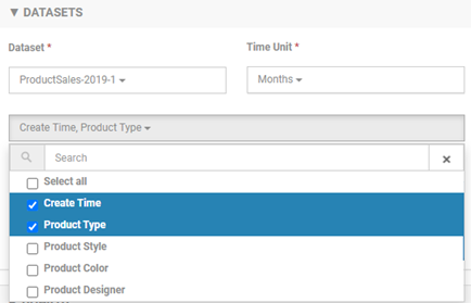
- Filters: Create Time, for range choose 1 YEAR FROM (one year from current) as shown below.

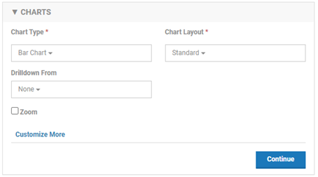
Charts section:
- Chart type: Bar Chart
- Chart Layout: Standard
- Drilldown From: None
An example is shown below.
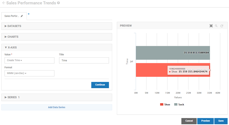
X-Axis section:
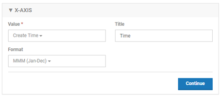
X-Axis is over time, so choose these values:
- Value: Create Time
- Title: Time
- Format: MMM (Jan-Dec). This represents the information by month.
An example is shown below.
Series 1 section:
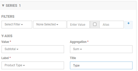
Series 1 defines the values on the Y-axis. There could be multiple sets of layered values. Series 1 is the first set of values.
- Value: Subtotal
- Aggregation: Sum
- Label: Product Type
- Title: Type
An example is shown below.
Previewing the chart
Preview of the chart, with the settings so far, is shown below. This chart represents sales performance trends by month.
Adding a drilldown from sales performance monthly to sales performance weekly
To the right of the first tab, click the + mark to start the drilldown chart.
Name the chart: Sales Performance Trends (Weekly).
First, modify monthly chart to specify the drilldown
Now that you've created the drilldown chart, make one adjustment to the first chart to link it to the new chart.
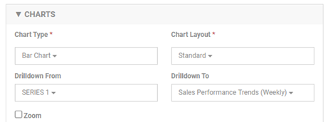
In the Charts section:
- Drilldown From: choose SERIES 1.
- Drilldown to: choose Sales Performance Trends (Weekly).
An example is shown below.
Now, you can define the values for the drilldown chart.
Drilldown chart, Datasets section:
- Time Unit: Weeks
- Data category drop-down: Create Time, Product Type (same)
- Filters: Create Time, for range choose 1 QUARTER FROM
Drilldown chart, Charts section:
- Chart type: Bar Chart
- Chart Layout: Standard
- Drilldown From: Series 1
Drilldown chart, X-Axis section:
X-Axis is over time, so choose these values:
- Value: Create Time
- Title: Time
- Format: MMM-dd (Jan-15).
Drilldown chart, Series 1 section:
Series 1 defines the values on the Y-axis. There could be multiple sets of layered values. Series 1 is the first set of values.
- Value: Subtotal
- Aggregation: Sum
- Label: Product Type
- Title: Sales
Test
Go back to the first tab and update the chart preview. You can now click on one of the bars of the chart and it will drill down to show you the data for a week.
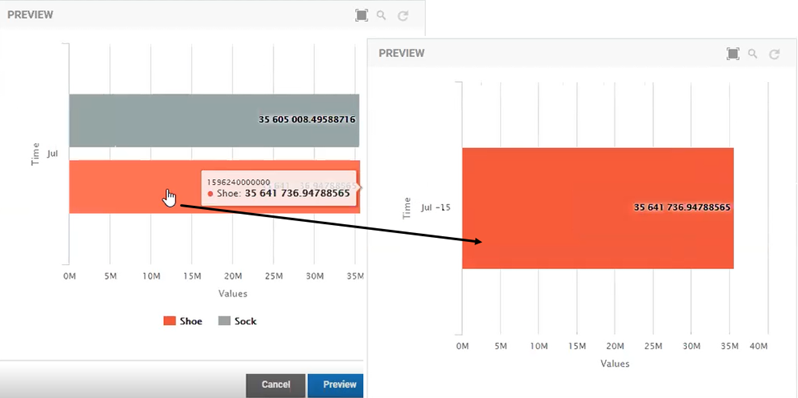
Defining your charts this way is much, much more efficient than trying to show all the data in one chart without drilldowns.
You could also define additional drilldown levels; for example, to view the data by day, hour, or minute.
Review Campaign Performance in a Specific Region (User-Defined Filter)
When the business runs a geographically specific business campaign, the analysts want to track the sales impact for that specific region. Their dashboard has a chart with sales activity for their current region. They can quickly update the filter to focus on regions where they are running active campaigns.
In designing a chart to show this information, consider that if you use the IP address itself to identify location, you multiply your data requirements by potentially more than four billion data points—for IPv4, the pool is 4,294,967,296 possible combinations.
Instead, you could use a lookup against an IP address database to map a region code, and use the region metrics in the chart. Depending on the nature of the dataset, you might use continent, with seven data points. If the sales are US-only, you might use State, with 50 data points; for England, you could use County, with 48 data points. Other countries have other region values. Building the chart based on a region, rather than on IP address, is much more efficient in terms of performance, as well as more usable to the end-user in terms of visualizing the data.
In an example using region, the dataset would be as follows:
- Time Unit: Month
- Group by drop-down: Region
- Filters: Timestamp, for range choose last 12 months (one year from current)
To create the Sales Regions Chart
- Define the dataset. Choose Datasets > New Dataset:
- Name: Sales-Regions
- Sharing: Public
- Save.
- Open the dataset and click New Dimension. Values:
- Name: Region
- Description: Location code for the region being viewed.
- Type: COUNTRY ABBREVIATION NAME
- Save.
- On the left, click Metrics, and then click New Metric. Values:
- Name: Subtotal
- Description: The sales amount before taxes.
- Type: Currency
- Aggregations: Choose Average, Minimum, Maximum, Sum (all values)
- Create the chart. Choose Charts > New Chart:
- Name: Sales by Region.
- Description: Show the sales by a specific region.
- Sharing: Public.
- Save.
- Open the chart to edit it. In the Datasets section:
- Dataset: Sales-Regions
- Time Unit: Days
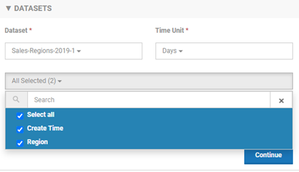
- Data Grouping: select all
Data grouping options are shown below.
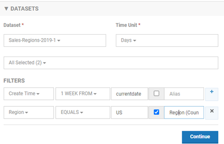
- Define dataset filters:
- Filter 1: CreateTime 1 week from current date.
- Region equals US. Check the box and choose Region (Country). This allows the user viewing the chart to edit it, so that the country can be changed to another country.
An example is shown below.
- Define values in the Charts section:
- Chart Type: Line Chart
- Chart Layout: Standard
- Drilldown From: Leave blank
- Define values in the X-Axis section:
- Value: Create Time
- Title: Time
- Define values in the Series 1 section:
- Value: Subtotal
- Aggregation: Sum
- Label: Region
- Title: Region Sales
- Save and preview.
The example below illustrates this chart. Although there is no data, you can see that the Region field is editable. US is the default, but the user can specify a different country.
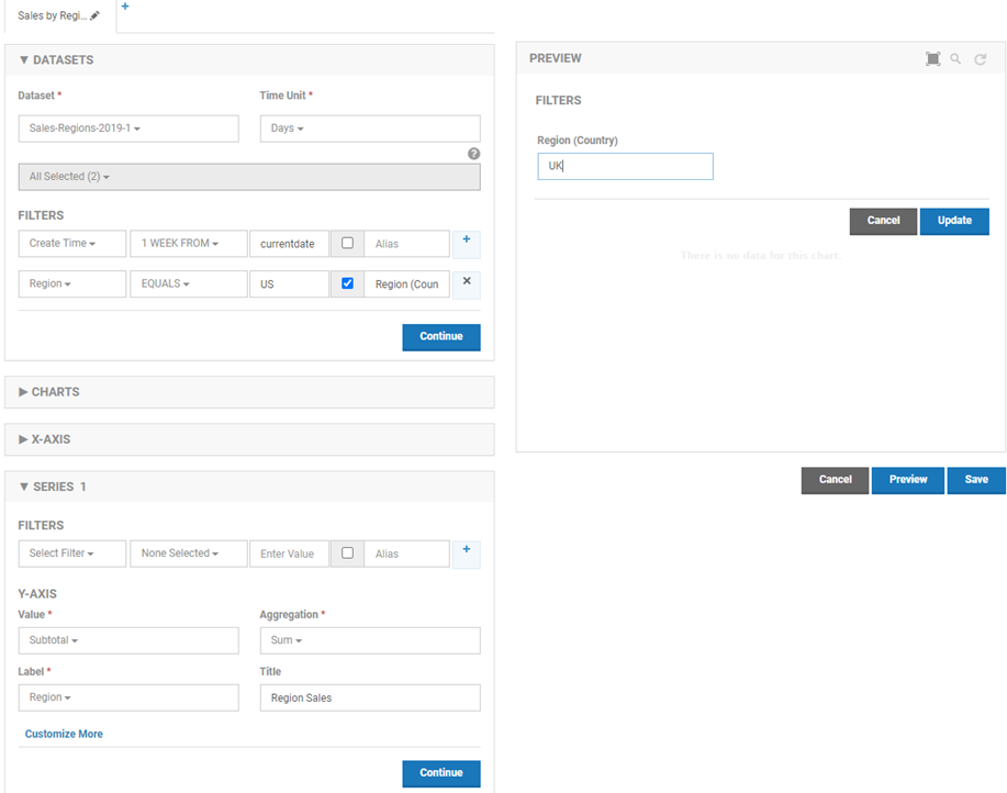
In this example, the US region is the default, so at runtime the US data is loaded. If the user chooses a different region, the data for that region is loaded. This is an efficient approach to the data representation.
To view these charts, you can define a new Dashboard.
To view the sample charts on a dashboard
- Choose Dashboards > New Dashboard. Values:
- Name: Sales Performance Trends
- Description: Sales Performance Trends
- Sharing: Public.
- Check Marked as Favorite
- Save.
- Click the Sales Performance Trends dashboard, and then click Add Chart.
- Choose the Sales Performance Trends and Sales by Region charts, and save. The dashboard display is shown below.
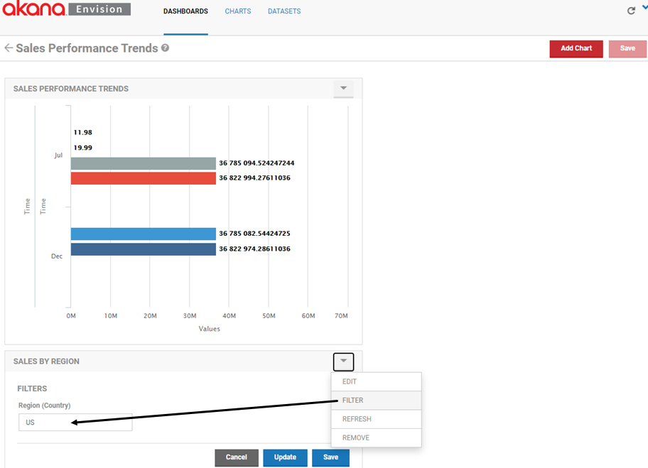
There is no data for the second chart, but you can see that the Region drop-down is available. Users can also manage each chart via the Edit, Filter, Refresh, and Remove options.