Detailed Customization Document
A reference guide for customizing Akana Community Manager.
Valid in Version: 2020.2.0 and later
On this page:
- Tenants
- Themes
- Customization Basics
- Customizing Site Pages
- Landing Page
- Login Entry Page (valid in version: 2020.2.4 and later)
- Login Entry Page (versions prior to 2020.2.4)
- Support Page
- API Documentation
- Agreements
- Customizing Page Content
- Customizing Page Styles
- Resource API
- Content API
- Adding New Views or Widgets
- Replacing Existing Widgets
- Authorization
- Hermosa Custom File Structure
- Bonita Custom File Structure
- Rendering API documentation in a third-party portal (Valid in version: 2019.1.31 and later)
Tenants
When you log in to an instance of the Community Manager developer portal user interface, you are logging in to a specific tenant. In the context of the Community Manager developer portal, each tenant has its own URL and its own set of apps, APIs, businesses, and groups. Configuration settings in the Community Manager developer portal apply to the current tenant. The tenant is a distinct Community Manager developer portal and community that has a logical separation from any other communities that might be hosted in the same product instance. A tenant might be a customer that is hosted within a shared system, such as the Akana SaaS platform, but has separation from other customers/ tenants.
The Tenant is managed by the Site Administrator. Each tenant generally has its own look and feel, controlled by one or more themes on the tenant.
Themes
What is a platform theme?
One theme is one instance of the Community Manager developer portal user interface, with a unique URL and a specific look and feel. As part of site configuration, the Site Admin has the option to configure more than one theme, all using the same data, available from multiple out-of-the-box themes.
You can define a separate instance for each theme; in addition, you can extend (clone) a theme, to create one or more custom themes that are based on the same standard theme. Each custom theme can then be modified independently of the others, so that there can be multiple instances of the same theme with different sets of customization applied to each.
When creating the tenant, it's best to choose one theme, such as Hermosa, as a starting point. The Site Admin can create additional themes later, in the Community Manager developer portal: More > Admin > Site and then choose Add Theme.
What themes are available?
Available themes are displayed in More > Admin > Site > Add Theme, in the Theme Name drop-down list:
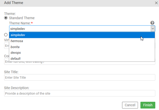
The following themes are available:
- Simple Dev—A simplified, streamlined user interface for developers, without Site Admin or Business Admin functionality.
Note: Simple Dev theme is deprecated in version 2020.2.0, and will be removed in a future release.
- Hermosa—Offers access to all features, including Site Admin and Business Admin functionality. In most cases, this help documentation shows dialog boxes and navigation from Hermosa Theme.
- Bonita—A simplified, streamlined user interface, based on Simple Dev theme and very similar to it, but with added functionality relating to APIs.
- DevOps—Used with the Lifecycle Coordinator product.
- Default (deprecated in Version: 2020.1.0)—The original user interface, with full functionality. Replaced by Hermosa theme.
How do I add a theme?
You can add one or more themes in the Site Settings page.
When you add or modify a theme, and save the updates in the Site Settings page, the platform generates default customization files for all current themes. If you have customization files already in place, those files are not affected. The default customization files, sometimes called scaffolding, are generated to help support any customization you might want to do in the future.
To add a theme
- Log in as a Site Admin and go to the Admin section.
- Go to Site.
- At the bottom, in the Themes section, click Add Theme.
- Specify settings:
- Choose Standard Theme or Custom Theme (specify a custom theme name, and then specify the standard theme that it's based on).
- Specify one or more comma-delimited virtual hosts for the theme.
- Specify the full console address for the theme, including trailing backslash.
- Specify the site title. This is important for SEO rankings.
- Specify the site meta description.
- Click Finish.
- On the Site Settings page, click Save to confirm.
How do I extend (clone) a platform theme?
The Community Manager developer portal includes several out-of-the-box standard themes.
You can extend a standard theme by defining one or more custom themes based on the same standard theme. By doing this, you can have two or more instances of the same platform theme, each with its own URL and potentially each with a different set of user-defined customizations. Each instance uses the same database.
You can use this to define multiple access points into the platform, each with its own set of customizations applied.
Sample scenario illustrating multiple customizations of look and feel:
Tenant ACMEPayments Corp has 10 partners; each partner has a different API on the platform, and each has an API admin who accesses the platform and exports metric information for the API.
When installing, the Site Admin defines ten custom themes, each based on Hermosa theme, each named for one of the 10 partners, and each with a different URL that includes the tenant name and partner name.
After defining one or more custom themes, the Site Admin applies the customization by uploading a custom.less file for each partner with the partner's company colors and logo.
When each API Admin logs in via the URL for his company, he sees the colors and logo for his company.
Notes:
- You'll need to have a unique URL for each theme.
- Each instance with a separate theme value can be customized later with a custom.less file. See Customizing Page Styles.
How do I configure values for a theme?
In Site Settings, you can add, edit, or delete a theme.
The values in the Add/Edit Theme overlay are explained below.
| Field | Description |
|---|---|
| Theme: Standard | Standard themes are out-of-the-box themes that ship with the product; however, they must be specifically installed. |
| Theme Name |
If you choose Standard Theme, choose a name out of the list of out-of-the-box themes available: hermosa, devops, bonita, or simpledev. Note: If the theme you want is not available for selection, ask the System Administrator to install it. |
| Theme: Custom |
Naming a custom theme allows you to define a new theme, based on an out-of-the box theme. You can then apply customization to the custom theme without affecting the out-of-the-box theme itself. Choose a simple theme name without spaces or special characters. |
| Theme Name |
Custom themes allow you to have a different branding on a different virtual host for the same theme. The custom theme name is used in the path of the uploaded resources for the theme. If you choose Custom Theme, specify the out-of-the-box theme it will be based on. |
| Virtual Hosts / Vanity Hostnames | A comma-delimited list of all hostnames that will be used to access the site (for example, vanity.example.com,other.example.com). The system uses these hostnames to determine which theme to present. In your DNS system, make sure there is an A record or CNAME record for each virtual hostname, and that it points to your system. |
| Console Address | The full URL for the site. As well as browser access, the console address is used in links to the site in various emails and notifications. Must be a full URL, including scheme, hostname, context path, and trailing forward slash; for example, https://vanity.example.com/site/. |
| Site Title | The page title for the site. This is the most important on-page SEO element, and typically appears in the browser tab and search engine results. Place relevant keywords first in the title, with branded information at the end. Keywords earlier in the title are given greater importance and will positively impact your organic rankings and traffic. Page titles should ideally be no more than 60 characters long to ensure they're not truncated on desktop, mobile, and tablet searches. |
| Site Meta Description | The meta description for the site. This is used by search engines. The description should lead with an explanation of what the site is about, followed by a call to action. It should be no more than 155 characters so that it isn't truncated in search results. |
Customization Basics
Customization Examples
You can also download a ZIP file that contains a wide selection of customization examples, including files with test data and readme files with instructions: More > Admin > Customization > Download Customization Samples. For more information, see Customization Samples.
Starter Files
You can provision your Community Manager developer portal instance with a theme-specific set of starter files for customization in the More > Admin > Customization page, via these two options:
- Generate customization files—Generates a set of files for the selected theme.
- Download customization files—Downloads a ZIP file of the default customization files for the selected theme. Users can then customize the files offline and upload the updated files.
Note: If customization files are already in place, they are not overwritten. For a listing of the starter files and a brief description of each, see Hermosa Custom File Structure or Bonita Custom File Structure.
Uploading Content
To upload content to the platform
- Log in as a Site Admin and go to the Admin section.
- Go to File Manager.
- In the Content section, click File Manager.
- Go to the folder to which you want to upload resources. Follow the instructions for the type of custom content you're uploading, making sure you follow the exact naming for the folder structure. Use the buttons at the top of File Manager to go up or down a level in the folder structure, and to upload a file or a ZIP archive.
Note: You might get a message that the file exists, even though you just created the folder. This is expected if you are replacing a default platform file. Click OK.
Uploading Resources
You can upload platform resources, such as avatars and other images, stylesheets, and custom pages, in the same way that you upload platform content. There is a different button to access the file structure for platform resources.
To upload resources to the platform
- Log in as a Site Admin and go to the Admin section.
- Go to Customization or File Manager.
- In the Resources section, click File Manager (or just File Manager on the Customization page).
- Go to the folder to which you want to upload resources. If you are modifying default platform files for the first time, you will need to generate the customization files. This action creates the file and folder structure. For instructions, see Starter files.
Use the buttons at the top of File Manager to go up or down a level in the folder structure, and to upload a file or a ZIP archive.
Note: You might get a message that the file exists, even though you just created the folder. This is expected if you are replacing a default platform file. Click OK.
Customizing Site Pages
Landing Page
To modify the landing page, you must download it, modify it offline, and then upload it to the same location.
To modify the landing page:
- Log in as a Site Admin and go to the Admin section.
- Go to File Manager.
- In the Content section, click File Manager.
- Click into the content/home/landing directory.
- Locate the index.htm file and download it.
- Modify the file offline, and then upload the modified file using File Manager.
Login Entry Page
Valid in Version: 2020.2.4 and later
You can customize the Community Manager developer portal user interface so that after logging in, rather than being taken to the Action Dashboard (home/dashboard), which is the default behavior, users are taken to a different page that you specify.
The customization Samples ZIP file (see Customization Samples) includes a working example of files that you can use as starter files, and a readme.md file with detailed instructions. It has separate file sets for Hermosa theme and for Bonita/Simple Dev theme, since the steps are a little different in Bonita/Simple Dev.
Notes:
- To get the customization ZIP file: see Starter Files.
- The specific customization example inside the ZIP file is in this folder: post_login_redirection.
At a high level, the steps are the same as for earlier versions (see Login Entry Page (versions prior to 2020.2.4) below), with some differences:
- The file you create is a different file, init.js.
- It references a new variable, customLoginPage, that you can use to specify the new post-login page.
- It belongs in a different part of the folder structure.
The basic steps are as follows:
- Step 1: Determine the page you want users to be taken to.
For Bonita/Simple Dev, you'll have to use the browser tools and the can.route.attr() method to determine the route value for the new page. You will use this value in Step 3 below.
- Step 2: Generate the starter customization files and download the customization ZIP file.
See Step 2: Generate the starter customization files and download the customization ZIP file below.
- Step 3: Set up an init.js file.
For file content, review the customization example. For Hermosa theme, that's all you need. For Simple Dev/Bonita, use the route value from Step 1 above.
- Step 4: Upload the init.js file to the Community Manager developer portal.
Path for Hermosa: /resources/theme/{theme_name}/SOA/CM/extensions/init.js.
Path for Simple Dev/Bonita: /resources/theme/{theme_name}/SOA/Dev/extensions/init.js.
- Step 5: Test.
See Step 5: Test below.
Login Entry Page (versions prior to 2020.2.4)
You can customize the Community Manager developer portal user interface so that after logging in, rather than being taken to the Action Dashboard (home/dashboard), which is the usual behavior, users are taken to a different page that you specify.
To set this up, you'll need to perform these high-level tasks (see procedures below):
- Step 1: Determine the page you want users to be taken to
- Step 2: Generate the starter customization files and download the customization ZIP file
- Step 3: Set up a custom_en-us.json file
- Step 4: Upload the custom_en-us.json file to the Community Manager developer portal
- Step 5: Test
Step 1: Determine the page you want users to be taken to
You might decide that you want users to be taken to the Apps > My Apps page, or the APIs > My APIs page, or the Help page.
Decide which page you want users to be taken to and note the URL.
The example below takes users to the Apps > My Apps page after login.
Step 2: Generate the starter customization files and download the customization ZIP file
As a starting point, complete these two basic steps in the Community Manager developer portal user interface (unless already done):
- Generate a set of customization files. This creates the folder structure for the customization files, and puts placeholder files in place.
- Download the customization ZIP file, which contains the customization starter files. You will customize those files in the next few steps.
For instructions, see Starter files.
Step 3: Set up a custom_en-us.json file
You will need to create a custom_en-us.json file; if this file exists, it overrides platform defaults.
In this file, you can set up some custom code so that users are taken to a different page after login, rather than the default /home/dashboard page.
As an example, let's say you want users to be directed to the Apps > My Apps page. The example below modifies the platform to direct users to this page after login.
{
"errors": {},
"labels":
{ "customLoginPage": "/home/myapps" }
,
"messages": {},
"validator": {
"errors": {}
}
}
Save the file, which you will upload to the platform in the next step.
Platform location for this file: /resources/theme/{theme_name}/locales/custom_en-us.json.
Additional examples
Some other examples of how the login page entry could look are shown below.
//"labels": { }, -> No custom login
//"labels": {"customLoginPage": "/home/customdashboard" }, -> Login takes user to a custom page (requires adding new page)
//"labels": {"customLoginPage": "/home/landing" }, -> Login takes user to landing page
//"labels": {"customLoginPage": "/home/apis" }, -> Login takes user to My APIs
Step 4: Upload the custom_en-us.json file to the Community Manager developer portal
In the Community Manager developer portal user interface, go to More > Admin > File Manager. In the Resources section, click File Manager. The File Manager window opens at the resources folder.
Make sure you know the name of the theme you are customizing. If your platform version doesn't have customized theme names, the main Community Manager developer portal theme name is default. If you're not sure of the theme name, see How can I determine the theme name?
Upload the custom_en-us.json file to /resources/theme/{theme_name}/locales.
Step 5: Test
Once you've uploaded the files, it's time to test.
To test the custom login:
- Log out.
- Clear the browser cache.
- Refresh the browser page.
- Log in. Upon login, you are taken to the new page.
Support Page
In the Community Manager developer portal user interface, the help link to the right of the top navigation bar leads to the Support page. Here, you can add content that's specific to your version of the Community Manager developer portal. You can also include a link to basic information about the Community Manager developer portal, such as signup: Basics Content Overview).
The URL for the Support page is:
{hostname}/#/{tenantid}/home/support
To customize the Support page for the Community Manager developer portal:
- Outside the platform, prepare an HTML file for the Support page, and name it index.htm.
- Login as a Site Admin and go to the Admin section.
- Go to File Manager.
- In the Content section, click File Manager. The File Manager window opens at the content folder.
- Click into the home directory and then the support directory. You will see the existing index.htm file in the folder.
- Optional: If you want to, you can rename the existing file so that you'd be able to restore it if needed. Click the Rename icon and change the name of the file, as shown below.
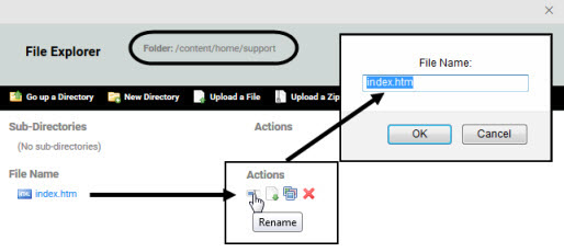
- Click Upload a File, navigate to the location of your new file, and upload it.
- Click outside the File Manager.
- Test:
- Go to the Support page.
- If you do not immediately see the new page, clear the cache and refresh the page.
- Verify that the page looks as expected and that any links work.
API Documentation
You can upload HTML files and associated images, PDF files, or other content to the API > Documentation section of the platform using the File Manager.
At minimum, you should provide the following files that are the entry point to your API documentation:
- Hermosa Theme: index page in the /documents folder.
- Bonita Theme: main documentation page accessed via Documentation link at top of Bonita main page.
There are two approaches to file upload:
- ZIP file:
- Hermosa Theme: Zip all the documentation files and upload them following the instructions in To upload API documentation files via the File Manager below.
- Bonita Theme: Zip all the documentation files into one zip file named documentation.zip, and upload it from the Content folder using the Upload a File option which uploads and unzips the file (not the Upload a Zip Archive option, which uploads without unzipping). The documentation folder is created automatically, and the files are placed in that folder. If you use a ZIP file, make sure that you are in the right folder when you upload it, and that it doesn't include extra folders that you don't want. When you upload, the file is unzipped as part of the upload process, using the paths, if any, specified within the ZIP file.
- Individual file uploads:
- Hermosa Theme: Follow the instructions in To upload API documentation files via the File Manager below.
- Bonita Theme: Get the Site Admin to create a documentation folder if there isn't one (exact name and case as given here), change directory into the documentation folder, and then upload the files individually.
For Hermosa Theme, the API Admin can upload the files following the procedure below.
For Bonita theme, the Site Admin must upload the files in Hermosa Theme: More > Admin > File Manager and then choose Content File Manager, in a folder below the content folder. The Site Admin must use or create a folder named documentation (so the path is content/documentation). As soon as the files are uploaded in Hermosa Theme, they are immediately visible in Bonita theme. Just log in and click the Documentation page to view the API documentation.
To upload API documentation files via the File Manager (Hermosa Theme):
- Go to API > Documentation.
- Click the File Manager icon in the upper-left corner of the documentation panel. The File Manager appears.
- Click Upload a File (to upload and unzip your documentation) or Upload a Zip Archive (to upload a static ZIP file, such as an SDK file that users might want to download).
- In the File Upload box, navigate to the location of the individual file or ZIP file you want to upload. Choose the file, and then click Open.
- Click Upload.
Agreements
Signup Agreement
To add a legal (signup) agreement, there are two steps:
- First, upload the legal agreement file to the content/system/agreements folder.
- Then, add the new agreement as a legal agreement for user signup on the platform.
Step 1: To upload a new legal agreement to the Akana API platform:
Note: Follow the procedure below to upload a legal agreement directly to the correct folder. This is the fastest way to do it. However, you can also upload via More > Admin > File Manager. In the Content section, click File Manager. You would then need to create the rest of the folder structure before uploading the file. It doesn't matter how the legal agreement is uploaded, but it must be in the content/system/agreements folder.
- Log in as a Site Admin and go to the Admin section.
- Go to Agreements.
- Click Upload Agreement.
Note: this functionality is only available to the Site Admin. If you do not see the Upload Agreement button on the right, you don't have the appropriate permissions.
- In File Manager, click Upload a File, then navigate to the location of the new developer agreement and upload it. The content is uploaded automatically to the content/system/agreements folder.
- The supported file types are Text (.txt, .text), HTML (.htm, .html), and PDF (.pdf)
Once you have uploaded the legal agreement, the next step is to make it a legal agreement for the platform.
Step 2: To use a specific legal agreement as an agreement used on user signup for the platform
Before setting up the signup agreement for the platform, you must upload it. See Step 1 above.
- Log in as a Site Admin and go to the Admin section.
- Go to Agreements.
- Click Add Agreement.
Note: this functionality is only available to the Site Admin. If you do not see the Add Agreement button on the right, you don't have the appropriate permissions.
- Specify values (all fields are required):
- Name: Used internally.
- Description: Displayed to users above the legal agreement when the user is logging in for the first time, or at the next login if the legal agreement changes.
- Content Path: Browse for the agreement users must accept. You can only choose a file previously uploaded to the content/system/agreements folder as per Step 1 above.
- Printable Content Path: Browse for the agreement users can print. You can only choose a file previously uploaded to the content/system/agreements folder as per Step 1 above. It can be the same file that you used in the Content Path field, or a more print-friendly file format such as PDF.
- Click Finish. The legal agreement immediately becomes the default for the platform, and new or existing users will need to accept it to log in.
Note: You can upload more than one legal agreement. If you have more than one, they display in a list view in the Legal Agreements page.
API Agreement
There are two steps to setting up an API legal agreement: first, uploading the file to the Community Manager developer portal, and then, activating it as your current API legal agreement.
To add an API legal agreement
- Go to APIs > My APIs > choose API > Agreements.
- Click Upload Agreement.
- In File Manager, click Upload a File.
- Upload the file.
- In the File Manager window, click the Publish box so that the legal agreement can be assigned to the API.
- When done, click outside the File Manager window.
After legal agreements have been uploaded and the name and description have been assigned, the agreements must be activated. An activated legal agreement displays in the platform API Access Wizard where it can be reviewed and accepted as part of the API access request process, when a developer requests access to your API.
To activate a legal agreement
- Go to APIs > My APIs > choose API > Agreements.
- Click Manage Agreements.
- Choose the legal agreement that you want to activate. In the Status column, click Activate. The legal agreement is activated and will be displayed to users requesting access to your API, as part of the API Access Wizard.
License Agreement
License agreements can be added as a step in the Add License wizard. On the Legal Agreements step, choose one or more legal agreements that will apply to the license. If needed, you can add or upload a new legal agreement:
- If necessary, first upload the file: click Upload Legal.
- Add the legal document to the license: click Add Legal, define the display name and description, and click Save.
Customizing Page Content
Logo
The process of adding a custom logo to the platform includes configuring your logo to comply with the logo file requirements (listed below), specifying the logo filename in the template and uploading it to the platform.
Logo File Requirements
Your logo must comply with the following requirements:
- Width should be no more than 295px.
- Height should be 46px.
- Background must be transparent.
- File format should be PNG.
- Specify the logo filename in the custom.less style sheet.
To specify your logo filename in the template
- Log in as a Site Admin and go to the Admin section.
- Go to Customization.
- If you want to work with the template for the Simple Developer Theme (Simple Dev) rather than the full user interface (Hermosa Theme), choose it from the drop-down list at the top (theme names might be different depending on your implementation). Styles for all themes are managed in the same place.
- To download a new custom_template.less file, click Download Custom Style Template.
- Rename it to custom.less.
- Load the custom .less file into an HTML editor and change the filename for this entry: @logo-img: url("images/{image_name}.png"); to the new logo filename.
- In the Custom Styles section, click Upload to upload the updated custom.less file. The upload process automatically executes the Rebuild Styles function, which rebuilds the style sheets.
To upload your logo file
- Log in as a Site Admin and go to the Admin section.
- Go to Customization.
- If you want to work with the template for the Simple Developer Theme (Simple Dev) rather than the full user interface (Hermosa Theme), choose it from the drop-down list at the top (theme names might be different depending on your implementation). Styles for all themes are managed in the same place.
- Click Rebuild Styles to ensure that all the proper style folders are generated.
Note: If you specified a custom logo name in custom.less and already uploaded the style sheet, the rebuild step is not required.
- Go to More > Admin > File Manager. In the Resources section, click File Manager. The File Manager window opens at the resources folder. Navigate to the resources/theme/default/style folder:
- Click New Directory and name it images.
- Click into the /images folder and upload your logo file.
- If for some reason the new logo does not display, try refreshing your browser cache and/or go to More > Admin > Customization, choose the theme, and click Rebuild Styles.
Favicon
The favicon is the small icon displayed on the browser tab and possibly in other parts of the browser. You can customize the icon that displays for your installation of the developer platform.
To modify the favicon for the Community Manager developer portal user interface
Note: If you haven't already done so, generate the customization files and also download the customization ZIP. For instructions, see Starter Files.
- Log in as a Site Admin and go to the Admin section.
- Go to File Manager.
- In the Resources section, click File Manager. The File Manager window opens at the resources folder.
- Navigate down to resources/theme/{theme_name}/style/images.
- From the images folder, click Upload a File.
- Go to the location of the favicon image and upload it. It should be an image file, 15 x 15 pixels in size, saved in the Windows favicon format with the name favicon.ico.
- To update the browser, clear cache and refresh the page. You might even need to close the browser and re-open to see the new favicon on the browser tab.
Left Menu
The left menu bar for all default pages in the API Platform user interface is controlled by the left_nav.json file.
This file includes definitions for all the left navigation menus in the Akana API platform user interface. Below are the top-level navigation pages:
- home
- api
- apiversion
- app
- group
- board (for Forum)
- system
- license
- user
You can customize any of the left menus to add, change, or delete entries.
Note: once you have a customized file in place, the platform always refers to your custom file. If you upgrade to a new version of the platform that itself includes new left menu items, or includes any other changes, you won't get the benefit of the updates. To keep up with the latest version, you'd need to get the updated left_nav.json file from the new version, merge your changes, and upload again.
Remember that once you customize a user interface component, you have to manually manage those changes from release to release.
To customize a specific left menu bar
Note: If you haven't already done so, generate the customization files and also download the customization ZIP. For instructions, see Starter Files.
- In the downloaded ZIP file for the current theme, identify the left_nav.json and left_nav_original.json files.
- Identify which section of the file to edit, depending on which left menu bar you want to customize.
- Edit the left_nav.json file, making sure that you preserve the JSON structure. For the original structure of the left menu, refer to the left_nav_original.json file, included in the starter files.
- Upload the modified left_nav.json file: More > Admin > File Manager. In the Resources section, click File Manager. The File Manager window opens at the resources folder. Create the path (if necessary) and upload the file. See Uploading Resources for more information.
- Test.
This article gives examples of the changes you will need to make to achieve different results. It includes illustrations of several different scenarios, including the file changes and the results in the user interface.
This article includes:
- Adding a link to the left menu in Hermosa theme
- Removing a link from the left menu in Hermosa theme
- Adding a link to the left menu in Bonita theme
- Removing a link from the left menu in Bonita theme
Adding a link to the left menu in Hermosa theme
Links can be added to the left menu by modifying the left_nav.json file. For information on where this file is located, see Hermosa Custom File Structure.
The following attributes are used in left menu objects:
- displayNameKey: points to a resource in the CustomApplicationResources.properties file for the label used on the menu item. See CustomApplicationResources.properties for more information.
- viewName: points to a view in metadata.json to determine where the menu item link takes the user.
- icon: points to an icon to be used for the menu item. The Community Manager developer portal uses icons from Font Awesome, so the "icon" attribute uses a "soa-ui-cm-icon-" prefix before the icon name in Font Awesome. In our example below, the item we added uses the "bell" icon from Font Awesome, so we set the "icon" attribute to "soa-ui-cm-icon-bell".
- authorization: any permissions needed for accessing the menu link. See Authorization for more information.
When you've done the updates, upload the modified file. The changes will be reflected in the left menu. For more information on uploading files, see Uploading Resources.
As an example, let's add a link in the left menu of the user profile page to a new page we already created. For information on creating a new page, see Creating New Pages in Hermosa Theme later in this document.
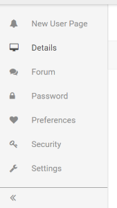
First, we edit the left_nav.json file and add the contents below.
Note: We copied the "user" section from left_nav_original.json, and then added a new link at the top, pointing to "newuserpage".
{
"user": [
{
"displayNameKey": "resource.menu.user.newuserpage",
"viewName": "newuserpage",
"icon": "soa-ui-cm-icon-bell"
}, {
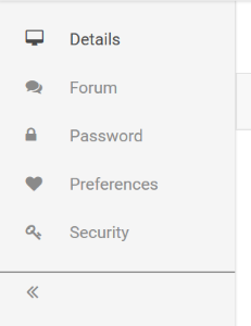
"displayNameKey": "resource.menu.user.details",
"viewName": "profiledetails",
"icon": "soa-ui-cm-icon-desktop"
}, {
"displayNameKey": "resource.menu.user.board",
"viewName": "board",
"authorization": {
"resource": "tenant",
"permissions": ["Modify"]
},
"icon": "soa-ui-cm-icon-comments"
}, {
"displayNameKey": "resource.menu.user.password",
"viewName": "password",
"icon": "soa-ui-cm-icon-lock"
}, {
"displayNameKey": "resource.menu.user.preferences",
"viewName": "preferences",
"icon": "soa-ui-cm-icon-heart"
}, {
"displayNameKey": "resource.menu.user.security",
"viewName": "security",
"icon": "soa-ui-cm-icon-key"
}, {
"displayNameKey": "resource.menu.user.settings",
"viewName": "settings",
"icon": "soa-ui-cm-icon-wrench"
}
]
}
Next, upload the modified left_nav.json file into the appropriate directory.
Finally, refresh the page, click on the User in the top right part of the header, and then click Profile. The Profile Details page should load, and the left menu on the page should now include a New User Page menu item. Clicking the new menu item takes the user to the new page.
Removing a link from the left menu in Hermosa theme
You can remove a link from the left menu by modifying the left_nav.json file. For information on where this file is located, see Hermosa Custom File Structure.
Note: To remove a link from a section in the left_nav.json file, you must include the entire section in left_nav.json while omitting the links desired.
When you've done the updates, upload the modified file. The changes will be reflected in the left menu. For more information on uploading files, see Uploading Resources.
As an example, let's remove a link from the left menu on the user pages.
First, we edit the left_nav.json file and add the contents below.
Note: We copied the "user" section over from left_nav_original.json and then removed the "settings" link near the bottom of the section.
{
	"user": [
		{
			"displayNameKey": "resource.menu.user.details",
			"viewName": "profiledetails",
			"icon": "soa-ui-cm-icon-desktop"
		}, {
			"displayNameKey": "resource.menu.user.board",
			"viewName": "board",
			"authorization": {
				"resource": "tenant",
				"permissions": ["Modify"]
			},
			"icon": "soa-ui-cm-icon-comments"
		}, {
			"displayNameKey": "resource.menu.user.password",
			"viewName": "password",
			"icon": "soa-ui-cm-icon-lock"
		}, {
			"displayNameKey": "resource.menu.user.preferences",
			"viewName": "preferences",
			"icon": "soa-ui-cm-icon-heart"
		}, {
			"displayNameKey": "resource.menu.user.security",
			"viewName": "security",
			"icon": "soa-ui-cm-icon-key"
		}
	]
}
Next, upload the modified left_nav.json file into the appropriate directory.
Finally, refresh the page, click on the User in the top right part of the header, and then click Profile. The Profile Details page should load, and the left menu on the page should now not include a Settings link.
Adding a link to the left menu in Bonita theme
Links can be added to the left menu by modifying the api_sub_nav.ejs, app_sub_nav.ejs and/or user_profile_sub_nav.ejs files. For information on where these files are located, see Bonita Custom File Structure.
The following attributes are typically used in left menu objects:
- name: points to a resource in the custom_en.json file for the label used on the menu item. For an example of this file, see Set up a custom_en-us.json file for more information.
- url: points to a page in widget_factory.js to determine where the menu item link takes the user. More specifically, it takes a call to the can.route.url function which takes an object which helps build the URL for the link. The following attributes can be given:
- page: the main page for the URL. In Bonita, this corresponds to what comes after the #! in the URL.
- id: the id for the object. For an API page, this would be the API id.
- versionId: the version id for the object. For an API page, this would be the API Version id.
- section: the section which comes at the end of the URL. For example, the API logs page is at apis/{apiId}/versions/{apiVersionId}/logs. "logs" is the section.
When you've done the updates, upload the modified file. The changes will be reflected in the left menu. For more information on uploading files, see Uploading Resources.
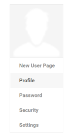
As an example, let's add a link in the left menu of the user profile page to a new page we already created. For information on creating new pages, see Creating New Pages in Bonita Theme later in this document.
First, we edit the user_profile_sub_nav.ejs file and add the contents below.
Note: This is the original content except that we added a new link at the top pointed to "newuserpage".
<%== soa.cm.imageUpload({
		"url": listener.attr("previewURL") || user.getAvatarUrl(),
		"upload": upload,
		"deleteBtn" : deleteBtn,
		"imgClasses" : "soa-control-cm-profile-avatar"
}) %>
<ul class="list-group soa-ui-cm-subnav soa-control-cm-subnav">
	<%== soa.cm.subNavItem({
		"name": soa.framework.globalize("labels.newuserpage"),
		"url": can.route.url({
			"id": user.getId(),
			"page": "users",
			"section" : "newuserpage"
		})
	}) %>
	<%== soa.cm.subNavItem({
		"name": soa.framework.globalize("labels.profile"),
		"url": can.route.url({
			"id": user.getId(),
			"page": "users",
			"section" : "details"
		})
	}) %>
	<%== soa.cm.subNavItem({
		"name": soa.framework.globalize("labels.password"),
		"url": can.route.url({
			"page": "users",
			"id": user.getId(),
			"section": "password"
		})
	}) %>
	<%== soa.cm.subNavItem({
		"name": soa.framework.globalize("labels.security"),
		"url": can.route.url({
			"page": "users",
			"id": user.getId(),
			"section": "security"
		})
	}) %>
	<%== soa.cm.subNavItem({
		"name": soa.framework.globalize("labels.settings"),
		"url": can.route.url({
			"page": "users",
			"id": user.getId(),
			"section": "settings"
		})
	}) %>
</ul>
Next, upload the modified file into the appropriate directory. In this case, it goes in SOA/Dev/user_profile_page/views.
Finally, refresh the page, click on the User in the top right part of the header, and then click Profile. The Profile Details page should load, and the left menu on the page should now include a "New User Page" menu item. Clicking the new menu item takes the user to the new page.
Removing a link from the left menu in Bonita theme
You can remove a link from the left menu by modifying the api_sub_nav.ejs, app_sub_nav.ejs and/or user_profile_sub_nav.ejs files. For information on where these files are located, see Bonita Custom File Structure.
When you've done the updates, upload the modified file. The changes will be reflected in the left menu. For more information on uploading files, see Uploading Resources.
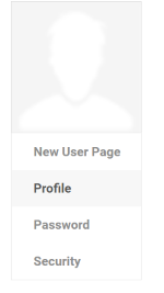
As an example, let's remove a link from the left menu on the user pages.
First, we edit the user_profile_sub_nav.ejs file and add the contents below.
Note: This is the original content except that we removed the "settings" link near the bottom of the section.
<%== soa.cm.imageUpload({
		"url": listener.attr("previewURL") || user.getAvatarUrl(),
		"upload": upload,
		"deleteBtn" : deleteBtn,
		"imgClasses" : "soa-control-cm-profile-avatar"
}) %>
<ul class="list-group soa-ui-cm-subnav soa-control-cm-subnav">
	<%== soa.cm.subNavItem({
		"name": soa.framework.globalize("labels.newuserpage"),
		"url": can.route.url({
			"id": user.getId(),
			"page": "users",
			"section" : "newuserpage"
		})
	}) %>
	<%== soa.cm.subNavItem({
		"name": soa.framework.globalize("labels.profile"),
		"url": can.route.url({
			"id": user.getId(),
			"page": "users",
			"section" : "details"
		})
	}) %>
	<%== soa.cm.subNavItem({
		"name": soa.framework.globalize("labels.password"),
		"url": can.route.url({
			"page": "users",
			"id": user.getId(),
			"section": "password"
		})
	}) %>
	<%== soa.cm.subNavItem({
		"name": soa.framework.globalize("labels.security"),
		"url": can.route.url({
			"page": "users",
			"id": user.getId(),
			"section": "security"
		})
	}) %>
</ul>
Next, upload the modified file into the appropriate directory. In this case, it goes in SOA/Dev/user_profile_page/views.
Finally, refresh the page, click on the User in the top right part of the header, and then click Profile. The Profile Details page should load, and the left menu on the page should now not include a Settings link.
Header
The page header shows at the top of every site page. By default, it includes links to main areas of the application: Dashboard, APIs, Apps, as well as the user's Profile.
You can customize the values in the page header by adding entries to the nav_extensions.js or quick_links_extensions.js files or by modifying the original header files.
This article gives examples of the changes you will need to make to achieve different results. It includes illustrations of several different scenarios, including the file changes and the results in the user interface.
This article includes:
- Adding a link to the header in Hermosa theme
- Removing a link from the header in Hermosa theme
- Adding a link to the header in Bonita theme
- Removing a link from the header in Bonita theme
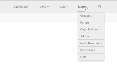
Adding a link to the header in Hermosa theme
Links can be added to the header by modifying the nav_extensions.ejs or quick_links_extensions.ejs files. For information on where these files are located, see Hermosa Custom File Structure.
Links added in nav_extensions.ejs will be added just above the "Help" link under the top level "More" dropdown of the header. Similarly, links added in quick_links_extensions.ejs will be added just above the "Logout" link under the top level user dropdown in the far right side of the header.
When you've done the updates, upload the modified files. The changes will be reflected in the header. For more information on uploading files, see Uploading Resources.
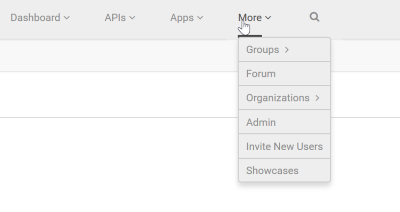
As an example, let's add a link in the header to the Showcases page we create in an example later in this document.
First, we edit the nav_extensions.ejs file and add the contents below.
Note: Menu items are simple <li> elements. Within the <li> elements, you can add a link. Here, we add a link to "#/home/showcases", which is our new page.
<li role="presentation" class="soa-ui-cm-secondary-resources-menu-item">
    <a href="#/home/showcases" class="soa-control-cm-handle-page-dirty soa-control-cm-menu-item-link" role="menuitem">
        <%= soa.framework.globalize("labels.showcases")%>
    </a>
</li>
Next, upload the modified nav_extensions.ejs file into the appropriate directory.
Finally, refresh the page and look at the More header dropdown. It should now include a "Showcases" menu item. Clicking the new menu item takes the user to the new page.
Removing a link from the header in Hermosa theme
Note: If you haven't already done so, generate the customization files and also download the customization ZIP. For instructions, see Starter Files.
You cannot modify a link in the header, or remove a link from the header, by modifying the nav_extensions.ejs or quick_links_extensions.ejs files. Instead, update the original files with the links—nav.ejs or quick_links.ejs. For information on where these files are located, see Hermosa Custom File Structure.
When you've done the updates, upload your files to these folders:
- nav.ejs: theme/hermosa/SOA/CM/nav/views
- quick_links.ejs: theme/hermosa/SOA/CM/quick_links/views
The changes will be reflected in the header. For more information on uploading files, see Uploading Resources.
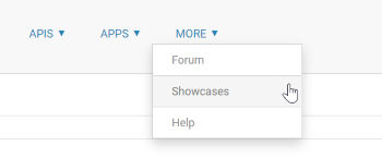
As an example, let's remove the "Help" link from the header.
First, we edit the nav.ejs file and remove the contents at the bottom of the file containing the "Help" link.
<li role="presentation" class="soa-ui-cm-secondary-resources-menu-item">
    <a href="#/home/support" class="soa-control-cm-handle-page-dirty soa-control-cm-menu-item-link" role="menuitem">
        <%= soa.framework.globalize("labels.help")%>
    </a>
</li>
Next, create the necessary path for the file—theme/hermosa/SOA/CM/nav/views. Upload the file into the theme/hermosa/SOA/CM/nav/views directory.
Finally, refresh the page and look at the More header dropdown. It should now not include the "Help" link at the bottom.
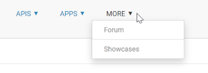
Adding a link to the header in Bonita theme
Links can be added to the header by modifying the nav_extensions.ejs or quick_links_extensions.ejs files. For information on where these files are located, see Bonita Custom File Structure for information on where these files are located.
Links added in nav_extensions.ejs will be added just above the "Help" link under the top level "More" dropdown of the header. Similarly, links added in quick_links_extensions.ejs will be added just above the "Logout" link under the top level user dropdown in the far right side of the header.
When you've done the updates, upload the modified file. The changes will be reflected in the header. For more information on uploading files, see Uploading Resources.
As an example, let's add a link in the header to the Showcases page we create in an example later in this document.
First, we edit the nav_extensions.ejs file and add the contents below.
Note: Menu items are simple <li> elements. Within the <li> elements, you can add a link. Here, we add a link to "#!showcases", which is our new page.
<li role="presentation" class="soa-ui-cm-secondary-resources-menu-item">
    <a href="#!showcases" class="soa-control-cm-handle-page-dirty soa-control-cm-menu-item-link" role="menuitem">
        <%= soa.framework.globalize("labels.showcases")%>
    </a>
</li>
Next, upload the modified nav_extensions.ejs file into the appropriate directory.
Finally, refresh the page and look at the More header dropdown. It should now include a "Showcases" menu item. Clicking the new menu item takes the user to the new page.
Removing a link from the header in Bonita theme
Links cannot be modified or removed from the header by modifying the nav_extensions.ejs or quick_links_extensions.ejs files. Instead, users must update the original files with the links—nav.ejs or quick_links.ejs. See Bonita Custom File Structure for information on where these files are located.
Once updated, the directory structure for the files must be created if it doesn't exist yet. Place nav.ejs in a directory named theme/bonita/SOA/Dev/nav/views. Place quick_links.ejs in a directory named theme/bonita/SOA/Dev/quick_links/views.
Finally, upload the modified files into the appropriate directory. The changes will be reflected in the header. For more information on uploading files, see Uploading Resources.
As an example, let's remove the "Help" link from the header.
First, we edit the nav.ejs file and remove the contents at the bottom of the file containing the "Help" link.
<li role="presentation" class="soa-ui-cm-secondary-resources-menu-item">
    <a href="#!help" class="soa-control-cm-handle-page-dirty soa-control-cm-menu-item-link" role="menuitem">
        <%= soa.framework.globalize("labels.help")%>
    </a>
</li>
Next, create the necessary path for the file—theme/bonita/SOA/Dev/nav/views. Upload the file into the theme/bonita/SOA/Dev/nav/views directory.
Finally, refresh the page and look at the More header dropdown. It should now not include the "Help" link at the bottom.
Footer
The page footer shows at the bottom of every site page. By default, it includes links to general information (About, Contact, Terms, Privacy) and a copyright statement. There is a thin line between the page and the footer.
You can customize the values in the page footer. For example, you can:
- Add a link.
- Remove a link.
- Modify a link so that it leads to a different page.
- Update the copyright year and/or legal statement.
To update the footer content, you will need to:
- Create one or more customization files to override the defaults.
- Upload the customization files to the correct location in the file system.
This article gives examples of the changes you will need to make to achieve different results. It includes illustrations of several different scenarios, including the file changes and the results in the user interface.
This article includes:
Creating a custom footer file
The footer file includes variable references to content for the following links in the page footer:
- About (link to placeholder URL, with a variable for the link copy)
- Contact Us (link to placeholder URL, with a variable for the link copy)
- Terms (link to placeholder URL, with a variable for the link copy)
- Privacy Policy (link to placeholder URL, with a variable for the link copy)
- Copyright: a variable for the copyright statement
Notes:
- The upload location in the file system is /resources/theme/default/templates/footer/footer.htm. However, note that you cannot download a default file. Follow these instructions to create a customization file, then upload it to the correct location in the file system to override the Community Manager developer portal default.
- Links in the footer.htm file can have a class attribute with either of these values:
- ext: clicking the link opens the link destination in a popup window.
- dialog: clicking the link opens the link destination in a dialog window.
- To revert to the default, if needed, simply remove the customization file and refresh the page.
- If the footer.htm file requires additional styles, you can add them to custom.less.
To create a custom footer file
Note: If you haven't already done so, generate the customization files and also download the customization ZIP. For instructions, see Starter Files.
- Modify the generated file footer.htm for your current theme as needed. You can update the footer file by:
- Updating the link destinations
- Replacing the variables in the footer.htm file with hardcoded copy
- Adding or removing links
Note: You can also update the footer by modifying a different customization file that controls some of the values in the footer. See Creating a custom properties file.
- Save the file. The next step is to upload it to the Community Manager developer portal. For more information, see Uploading Resources.
Updating the link destinations
The starter content file includes placeholder links that might not be valid for your company. You can update the footer to point to specific pages on your company website.
For example, the line below is the default content for the Contact link in the footer:

You can update the contact URL to point to your company's contact page. Your updated <a> link, with your own URL, might look something like this:

Replacing the variables in the footer.htm file with hardcoded copy
The variables in the footer.htm file are within triple curly braces, and they point to values defined in a different file, CustomApplicationResources.properties (see Creating a custom properties file below).
You can redefine these values in the properties file, but you can also remove the variables and replace them with hardcopy content.
For example, the line below has a custom URL, but still has the default copy for the Contact link in the footer:
You could update the contact URL, and you could also remove the variable reference and replace it with updated inline copy to a Contact Us link. Your updated <a> link might look something like this:
<a id="footerContact" href="http://acmepaymentscorp.com/contact" class="ext">Contact Us</a>
Adding or removing links
The default footer includes a set of links, listed in Creating a custom footer file above. You can add or remove links by updating the copy in the footer.htm file.
For example, you might just want About, Contact Us, and a copyright statement. You could use this content:
<ul class="footerNav clearthis">
  <li>
    <!-- class="ext" will open the link in new tab -->
    <a id="footerAbout" href="http://acmepaymentscorp.com/about" class="ext">About Us</a>
  </li>
  <li>
    <a id="footerContact" href="http://acmepaymentscorp.com/contact" class="ext">Contact Us</a>
  </li>
  <li id="footerLegal" class="legal">Copyright © 2017-2020 ACME Payments Corp, Inc. All Rights Reserved.</li>
</ul>
Creating a custom properties file
You might want to keep the placeholders but redefine the values. For example, instead of link copy of About, you might want About Us, or some other wording. Rather than using hard-coded copy in the footer.htm file, you can define the new placeholder values in the CustomApplicationResources.properties file, and then upload the file to the correct place in the filesystem.
Note: If you have a footer.htm file in place with hard-coded values, such as the copyright statement, the values in the footer.htm file override the values in the CustomApplicationResources.properties file.
To redefine the placeholder values in the CustomApplicationResources.properties file
Note: If you haven't already done so, generate the customization files and also download the customization ZIP. For instructions, see Starter Files.
- In the CustomApplicationResources.properties file for your current theme, add an entry for each value you want to redefine. The example below provides new values for each variable in the default footer copy.
footer.menu.about=About Acmepaymentscorp
footer.menu.contact=Contact Us
footer.menu.terms=Terms of Use
footer.menu.privacy=Our Privacy Statement
footer.menu.legal=© 2012-2020 Acmepaymentscorp, Inc. All Rights Reserved.
- Save the file. The next step is to upload it to the Community Manager developer portal. For more information, see Uploading Resources.
Examples
The examples below show changes to the default footer in a few scenarios based on uploading customization files. Examples include:
- Example 1: Default footer
- Example 2: Footer with custom link copy defined
- Example 3: Footer with copyright statement updated: hard-coded
- Example 4: Footer with copyright statement updated: redefining the copyright statement variable
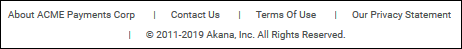
Example 1: Default footer
The example below shows the default values for a specific tenant:

Example 2: Footer with custom link copy defined
Let's say you want to update the link text in the default footer.
You can customize by defining and uploading a CustomApplicationResources.properties file.
The example below shows the file content and the results. Upload the file, with the following contents, to the /resources/theme/default/i18n folder.
footer.menu.about=About ACME Payments Corp
footer.menu.contact=Contact Us
footer.menu.terms=Terms of Use
footer.menu.privacy=Our Privacy Statement
When you refresh the page, the footer looks like the example below:
Example 3: Footer with copyright statement updated: hard-coded
Note: If you haven't already done so, generate the customization files and also download the customization ZIP. For instructions, see Starter Files.
Let's say you want to update the copyright statement in the footer. The copyright statement only appears in the footer, which is on every page, so if you hard code the statement in the footer.htm file it will be updated everywhere.
You might also need to update the page destinations that the links in the footer go to.
In the downloaded starter files in the customization ZIP, identify the generated footer.htm file for your current theme.
Use the same file contents, but change the copy of the last <li> tag, for the legal statement, to a hard-coded legal statement, as follows:
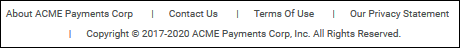
<li id="footerLegal" class="legal">Copyright © 2017-2020 ACME Payments Corp, Inc. All Rights Reserved.</li>
When you refresh the page, the footer looks like the example below:
Note that the above example is the result of uploading two different customization files:
- CustomApplicationResources.properties to modify the link text
- footer.htm to modify the link destinations and the copyright statement
Example 4: Footer with copyright statement updated: redefining the copyright statement variable
Let's say you want to update the copyright statement in the footer, but rather than hard coding the copy as shown above, you want to redefine the copy. You might want to do this if your copy is translated, if you have multiple themes that might have different copy, or if you want to reference the copyright variable elsewhere in the user interface.
You can do this by defining and uploading a CustomApplicationResources.properties file, as in #2 above, but this time defining an additional property in the file, the com.soa.atmosphere.footer.legal property.
The example below shows the file content and the results. Upload the file, with the following contents, to the /resources/theme/default/i18n folder. The copy is slightly different from the example in #2 so you can see the difference in the results.
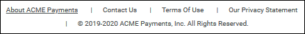
footer.menu.about=About ACME Payments
footer.menu.contact=Contact Us
footer.menu.terms=Terms of Use
footer.menu.privacy=Our Privacy Statement
com.soa.atmosphere.footer.legal= © 2019-2020 ACME Payments, Inc. All Rights Reserved.
When you refresh the page, the footer looks like the example below:
Note: If you update the legal statement by defining the com.soa.atmosphere.footer.legal property in the CustomApplicationResources.properties file, as shown above, you must not also have the legal statement defined in the footer.htm file. A hard-coded value in the footer file will override the com.soa.atmosphere.footer.legal property.
Default Icons
The platform includes default icons for apps, APIs, and other resources. You can specify new defaults by uploading new icons of the same filename, size, and type to the folder where the default files are stored.
The folder structure is not visible unless custom assets have already been created. If you have to create the folder structure, make sure you use the exact naming and spelling given below. Essentially you are creating the following files, two sizes for each resource for which you want to customize the icon.
| Resource | Main Icon (console/style/images/) | Small Icons (console/style/images/) |
|---|---|---|
| API | avatar_api_75x75.png | avatar_api_25x25.png |
| API Version | avatar_app_version_75x75.png | avatar_api_version_25x25.png |
| App | avatar_app_75x75.png | avatar_app_25x25.png |
| App Version | avatar_app_version_75x75.png | avatar_app_version_25x25.png |
| Alert | avatar_alert_75x75.png | avatar_alert_25x25.png |
| API Access Request | avatar_api_access_req_75x75.png | avatar_api_access_req_25x25.png |
| Group | avatar_group_75x75.png | avatar_group_25x25.png |
| Discussion | avatar_discussion_75x75.png | avatar_discussion_25x25.png |
| Ticket | avatar_ticket_75x75.png | avatar_ticket_25x25.png |
To modify the default icon for apps, APIs, or other resources on the developer platform
Note: If you haven't already done so, generate the customization files and also download the customization ZIP. For instructions, see Starter Files.
- Log in as a Site Admin and go to the Admin section.
- Go to File Manager.
- In the Resources section, click File Manager. The File Manager window opens at the resources folder.
- Navigate down to resources/console/style/images.
- From the images folder, click Upload a File.
- Go to the location of the new image or images and upload. You'll need to make sure your new default icons have the following properties:
- File type: PNG graphics format.
- Dimensions: 75 x 75 pixels for the larger icon and 25 x 25 pixels for the smaller one.
- Filenames: Refer to the table above for the filenames for each type of resource.
- To update the browser, clear cache and refresh the page. You might even need to close the browser and re-open to see the new default images.
Internationalization
There are two places in the product that drive internationalization:
- /theme/default/i18n/CustomApplicationResources_[LOCALE].properties
- /locales/custom_[LOCALE].json
CustomApplicationResources.properties
The CustomApplicationResources.properties files are artifacts of the old framework and contain only a limited set of predefined labels:
#com.soa.atmosphere.site.title=Your Community Manager developer portal
#com.soa.atmosphere.footer.legal=Read the legal agreements.
#com.soa.atmosphere.footer.rights= © Your Company. All rights reserved. Note: No additional values should be added to this file.
Custom.json
The product leverages the jsperanto framework for internationalization – for more information, see https://github.com/jpjoyal/jsperanto. All i18n strings in EJS views and widget_factory are defined in these files. The file is as follows:
{
  "errors": {},
  "labels": {
    "key": "value",
    "key": "value"
  },
  "messages": {},
  "validator": {
  "errors": {}
  }
}
Using Internationalization
All language-specific text in the user interface should be externalized in custom_[LOCALE].json files and accessed via the soa.framework wrapper that has been provided in the product. For example:
- in EJS files:
<%=soa.framework.globalize("labels.key", replacements)%> - in JavaScript files:
SOA.Framework.Common.I18N.globalize(key, replacements);
Customizing Page Styles
The platform comes with a default look and feel, including styles, colors, navigation, logo, and so on. These platform default styles are stored in a stylesheet which is dynamically generated from a file named custom.less.
You can change the color scheme for platform elements such as:
- Site background color
- Left and top navigation
- Text content area
- Pop-up dialog elements
- Horizontal rules
- Text color of input fields
- Default link colors
If you want to customize platform styles, follow the basic steps below.
Note: When you upload new styles to the platform, you will need to clear your browser cache and refresh the page to see the changes.
To customize platform styles:
Note: If you haven't already done so, generate the customization files and also download the customization ZIP. For instructions, see Starter Files.
- Log in as a Site Admin and go to the Admin section.
- Go to More > Admin > Customization.
- From the Theme drop-down list, choose the theme.
- Download the current custom style template. Your choice depends on whether there is already customization in place:
- No previous customization: click Download Custom Style Template and save the default custom_template.less file to your external filesystem.
- Existing customization: click Download Custom Styles and save the default custom_template.less file to your external filesystem.
- Not sure: click Download Custom Styles. If there is customization you will not lose it; if there is no customization, you will get the custom style template.
Note: Alternatively, if there is no previous customization, you can use the starter custom.less file for the current theme, in your downloaded customization files. For existing customization, you can also use the File Manager button and navigate to the custom.less file to download/edit. See Hermosa Custom File Structure or Bonita Custom File Structure for information on where the custom.less file can be found.
- Modify the styles as needed.
- Upload the revised file to the platform using the Upload Custom Styles button or the File Manager button.
Note: If using File Manager, you must click Rebuild Styles to incorporate your stylesheet changes. For instructions with File Manager, see Uploading Resources.
- Clear your browser cache and refresh the page to see the changes.
Note: The platform uses other stylesheets, such as style.css or supplement.css. Do not modify these stylesheets. All customizations should be stored in custom.less as explained above.
Examples
Example 1: Change text color
Let's say you want to update the non-link text color on all pages to red.
You can customize by defining and uploading a custom.less file as described above.
The example below shows the changed content and the results.
// color of link text
// @link-color: @main-color;
// The color of the non-link text
 @plain-text-color: red;
When you clear your browser cache and refresh the page, the site text looks like:
Example 2: Create extended theme (inherits text color from Example 1)
Now let's say you create an extended theme from hermosa (the theme used in Example 1).
When you login to the new extended theme, you will see it inherits the text color change we made in Example 1:
Example 3: Change link color of extended theme (does NOT inherit text color from Example 1)
Now let's edit the custom.less file for the extended theme.
We will change the link text to yellow, but keep the non-link text as its default:
// color of link text
 @link-color: yellow;

// The color of the non-link text
// @plain-text-color: #7f7f7f;
When you upload the changes as described above, clear the browser cache and refresh the page, the site text and link text both come from the extended theme's custom.less file, so the non-link text will fallback to the default, and the link text will now show as yellow:
Resource API
When a resource is requested by the Community Manager developer portal, there is an algorithm it calls to search for that resource.
Resources are typically requested via a URL in this format:
.../ui/apps/<versionid>/resources/...
For example, let’s say we have created an extended theme called clonedhermosa and we are requesting a resource metadata.json. The path for that request would be:
ui/apps/atmosphere/_Vk7glUZDRzuuP1VJQMmUNBA/resources/theme/clonedhermosa/SOA/CM/extensions/metadata.json
The algorithm would first look in the database for this path:
resources/theme/clonedhermosa/SOA/CM/extensions/metadata.json
If not found, it would look at the parent of the custom theme, which, in this case, is hermosa. So the next place it would look in the database would be for this path:
resources/theme/hermosa/SOA/CM/extensions/metadata.json
If not found here, it would look in the hermosa bundle for that resource path.
If still not found, it would go to the parent of the hermosa theme, which is the "default" theme. So it would check the database for the following path:
resources/theme/default/SOA/CM/extensions/metadata.json
If still not found, it would check the default bundle for that resource path.
If still not found, it would check this path:
resources/console/SOA/CM/extensions/metadata.json
Note: You can also load resources from the local filesystem to test changes. This must be configured in the Akana Administration Console. Once logged in, click on the Configuration tab and click on the com.soa.atmosphere.console category. The atmosphere.console.config.stealEnvironment property must be set to development. Then click the Apply Changes button. Then click on the com.soa.uif category and set the uif.config.resourceBundlePath property to a file path to your local files. Then click the Apply Changes button. After these changes, the resource retrieval algorithm will first check this local path for the resource before going through the checks described above.
Content API
When content is requested by the Community Manager developer portal, it uses the Content API to retrieve it.
Content resources are typically requested via URL in this format:
.../content/...
It then uses the current tenant name to find that content. For example, if we are requesting /content/system/agreements and our tenant name is named development, we would look for the content with the path tenants/development/content/system/agreements.
Note: You can also load content from the local filesystem to test changes. This must be configured in the Akana Administration Console. Once logged in, click on the Configuration tab and click on the com.soa.atmosphere.console category. The atmosphere.console.config.stealEnvironment property must be set to development. Then click the Apply Changes button. Then click on the com.soa.uif category and set the uif.config.resourceBundlePath property to a file path to your local files. Then click the Apply Changes button. After these changes, the resource retrieval algorithm will first check this local path for the resource before going through the checks described above.
Adding New Views or Widgets
If branding alone is insufficient to achieve the desired customization, you could:
- Add a new view or widget for a new page.
- Replace the view or a widget entirely for a page.
- Alter the existing view.
To add a new view or widget, follow the following process:
- Write the CanJS view, controller and optional model.
- Modify the metadata.json and widget_factory.json files to add the new view, or to add a new widget to an existing view.
- Create a zip file with the modified files.
- Upload the zip file in the Community Manager developer portal user interface: Admin > File Manager > Content.
The process for replacing a view or widget is similar to creating a new one:
- Write the replacement CanJS view, controller and optional model.
- Modify the metadata.json and widget_factory.json files, adding the replacement view with the same objtype and view parameters as the existing view. This essentially overwrites the existing definition in the system.
- Create a zip file with the modified files.
- Upload the zip file in the Community Manager developer portal: Admin > File Manager > Content.
Replacing Existing Widgets
A widget is made up of a CanJS view (EJS) and corresponding controller. Altering existing widgets in the product is not a common practice since any significant changes to the view (EJS) files typically means that you need to change the controller as well, but there might be some cases (for example, adding a link) that justifies modifying the EJS file only.
To modify the EJS file simply upload a new EJS file into the Community Manager developer portal content file structure to replace the existing file. For example, if the path of the EJS file is:
/resources/[VER]/SOA/CM/common/notifications/views/notifications.ejs
Then just add a new notifications.ejs file with the same path under theme/hermosa in the Community Manager developer portal content file structure (Admin > File Manager > Content).
Authorization
When adding new links or pages, you can also define which users have access to that link/page. This is done with the authorization attribute within the modified .json file (for example, metadata.json, left_nav.json).
Below are the attributes commonly used within the 'authorization' object in the .json file. Most of these correspond to the security roles and permissions set up on the platform. For more information, see Security Roles and Role Memberships (Policy Manager help).
| Attribute | Description |
|---|---|
| loggedIn | Boolean typically set to "true", which indicates the link/page is authorized for any logged in user. |
| resourceType | Defines which platform object type needs the authorization for this link/page. Available values are: app, app-version, api, apiversion, tenant, business, group, resource, deploymentzone, license, domain, promotion, model, modelversion. |
| resourceKeyType | Defines which platform object key type needs the authorization for this link/page. Available values are: Organization, Service, Contract, Container, Policy, Identity, Process, Script, Certificate. |
| resource | Defines which platform resource needs the authorization for this link/page. Available values are: business, resource, tenant |
| permissions | Defines which actions are allowed for the given platform type. Available values are: Full Control, Add, Read, Modify, Delete, Monitor. The permissions are given as an array of values so that multiple actions can be allowed (for example, ["Read", "Modify"]) |
Hermosa Custom File Structure
| Filename/Path | Description |
|---|---|
| /resources/theme/hermosa/i18n/CustomApplicationResources.properties | Override/add placeholder labels/messages that can be used in pages. |
| /resources/theme/hermosa/i18n/CustomApplicationResources_en-US.properties | Override/add placeholder labels/messages that can be used in pages (for US English). |
| /resources/theme/hermosa/less/custom.less | Allows you to customize the styles in the site, in LESS pre-compiler format. |
| /resources/theme/hermosa/locales/custom_en-us.json | Override default actions (that is, default page after login) as well as labels, messages in the portal pages. |
| /resources/theme/hermosa/SOA/CM/extensions/init.js | The initialization file for customization. All custom JavaScript files that are used for customization must be loaded in init.js. |
| /resources/theme/hermosa/SOA/CM/extensions/left_nav.json | Allows you to customize the left navigation items in the site. You can add, modify, or delete pages from the left navigation menu. |
| /resources/theme/hermosa/SOA/CM/extensions/left_nav_original.json | The original content of the left navigation items in the site. Content can be copied out of this file when adding content to the left_nav.json file. |
| /resources/theme/hermosa/SOA/CM/extensions/metadata.json | Allows you to add/remove pages to/from the Community Manager developer portal and modify authorization for access to Community Manager developer portal pages. |
| /resources/theme/hermosa/SOA/CM/extensions/nav_extensions.ejs | Allows you to add items to the top menu in the header. |
| /resources/theme/hermosa/SOA/CM/extensions/quick_links_extensions.ejs | Allows you to add items to the user profile pull-down menu in the header. |
| /resources/theme/hermosa/SOA/CM/extensions/widget_factory.js | Allows you to configure any new pages that were added in metadata.json. |
| /resources/theme/hermosa/SOA/CM/nav/views/nav.ejs | The original content of the top menu items in the header. Can be updated to modify/remove items from the original top menu items in the header. |
| /resources/theme/hermosa/SOA/CM/quick_links/views/quick_links.ejs | The original content of the user profile pull-down menu items in the header. Can be updated to modify/remove items from the original user profile pull-down menu items in the header. |
| /resources/theme/hermosa/style/images/logo.png | Default custom logo image. |
| /resources/theme/hermosa/templates/footer/footer.htm | Allows you to customize the footer content of the Community Manager developer portal pages. |
Creating New Pages in Hermosa Theme
In this section:
- Example 1a: Creating a New Static View in Hermosa Theme
- Example 1b: Creating a New Static View in Hermosa Theme, with override of default redirect behavior (valid in version: 2020.1.8 and later)
- Example 2: Creating a New Dynamic View with a Controller in Hermosa Theme
Example 1a: Creating a New Static View in Hermosa Theme
A common customization task is to add a new view in the Community Manager developer portal to support static content from the Community Manager developer portal content file structure. For example, you might want to add a "Showcases" page that lists all the best apps that have been built and provides links to them.
To set this up you'd have to create and upload two files:
- Create a metadata.json file and upload it to the platform (see Uploading Resources for more information):
- Create the metadata.json file along the lines of the example shown below.
- Upload the new file to the Resources folder structure (create folders as needed, be sure case is exact on folder names). In the Community Manager developer portal: More > Admin > Customization. At top of page, click File Manager.
- In the resources folder, create additional folders to create this path: resources/theme/hermosa/SOA/CM/extensions
- In the extensions folder, upload the metadata.json file.
- Create the new content page and upload it to the platform in Content (see Uploading Content for more information):
- Offline, develop your index.htm content file.
Note: The new page must be named index.htm. The filename must be index, and the file extension must be htm, not html.
- In the Community Manager developer portal: More > Admin > File Manager. In the Content section, click File Manager.
- In the content folder, create additional folders to create this path: content/home/showcases.
Note: the path is defined, in the sample file below, by the value of objType, which is home, and the value of view, which is showcases.
- In the showcases folder, upload the index.htm file.
- Offline, develop your index.htm content file.
- Test. Go to the landing page, then change the URL from home/landing to home/showcases to view the new page.
Note: You might need to refresh the page.
Sample metadata.json file for adding a new static content view
The following metadata.json file shows how a widget.document widget can be added to a new view.
Note: Line 27 of the file below references widget.document, which is a standard widget that renders the index.htm file from the Community Manager developer portal content file structure at the path corresponding to the browser URL. For example, "#/home/showcases" will automatically load "/home/showcases/index.htm" from the content file structure.
{
  "layoutStructure":[
    {
      "objType":"home",
      "view":"showcases",
      "layout":[
  {
    "widgetInstance":"Main",
    "widget":"widget.horiz.tiling",
    "priority":"100"
  },
  {
    "widgetInstance":"Header",
    "widget":"widget.header",
    "parentWidgetInstance":"Main",
    "parent":"widget.horiz.tiling",
    "priority":"1000"
  },
  {
    "widgetInstance":"Content-Widest",
    "widget":"widget.horiz.tiling",
    "parentWidgetInstance":"Main",
    "parent":"widget.horiz.tiling",
    "priority":"2200"
  },
  {
    "widgetInstance":"Landing",
    "widget":"widget.document",
    "parentWidgetInstance":"Content-Widest",
    "parent":"widget.horiz.tiling",
    "priority":"2202"
  },
  {
    "widgetInstance":"Footer",
    "widget":"widget.footer",
    "parentWidgetInstance":"Main",
    "parent":"widget.horiz.tiling",
    "priority":"3000"
  }
      ]
    }
  ]
}
Example 1b: Creating a New Static View in Hermosa Theme, with override of default redirect behavior
Valid in Version: 2020.1.8 and later
It is a feature of the Community Manager developer portal page behavior that if a user is on a specific public page, and then logs in, the user is taken back to the same page after login. This behavior is designed for maximum usability. For example, the user might be on an API Details page, and there might be many APIs. If the user then logs in, it's likely that the user might want to be redirected to the same API page.
There are a few developer portal pages that are excluded from this behavior. These are instances where the user, after login, is taken to the Action Dashboard page instead (/home/dashboard). A couple of examples of these pages are:
- The main landing page.
- The login page itself.
- The support page.
In the example above, Example 1a: Creating a New Static View in Hermosa Theme, if a user is on the custom page that you added, and then logs in, the user is taken back to the custom page.
If you do not want this behavior, you can add a line of code into your metadata.json file to exclude the custom page from this behavior. The extra line, within the layoutStructure element and below the view element in the metadata.json file, is:
"defaultPageAfterLogin" : true,
The information below outlines an example that includes this line of code in the metadata.json file. This example adds a "What's New?" page to the developer portal content.
The steps for uploading the custom files, and for testing, are the same as in Example 1a: Creating a New Static View in Hermosa Theme above. The only functional difference is Line 6 in the metadata.json file. This example uses a different value for view (line 5 in the metadata.json file) to illustrate a slightly different usage scenario. The value of view can be whatever you need, but the file name in the specified folder must be index.htm.
HTML file name and location:
/content/home/whatsnew/index.htm
Metadata.json file name and location:
/resources/theme/hermosa/SOA/CM/extensions/metadata.json
Metadata.json file content:
{
  "layoutStructure":[
    {
      "objType":"home",
      "view":"whatsnew",
      "defaultPageAfterLogin" : true,
      "layout":[
  {
    "widgetInstance":"Main",
    "widget":"widget.horiz.tiling",
    "priority":"100"
  },
  {
    "widgetInstance":"Header",
    "widget":"widget.header",
    "parentWidgetInstance":"Main",
    "parent":"widget.horiz.tiling",
    "priority":"1000"
  },
  {
    "widgetInstance":"Content-Widest",
    "widget":"widget.horiz.tiling",
    "parentWidgetInstance":"Main",
    "parent":"widget.horiz.tiling",
    "priority":"2200"
  },
  {
    "widgetInstance":"Landing",
    "widget":"widget.document",
    "parentWidgetInstance":"Content-Widest",
    "parent":"widget.horiz.tiling",
    "priority":"2202"
  },
  {
    "widgetInstance":"Footer",
    "widget":"widget.footer",
    "parentWidgetInstance":"Main",
    "parent":"widget.horiz.tiling",
    "priority":"3000"
  }
      ]
    }
  ]
}
In the above:
- Line 5, view, defines the name of the folder where the custom index.htm page resides.
- Line 6, defaultPageAfterLogin, defines the behavior, so that a user logging in from that page is not taken back to it after login.
Example 2: Creating a New Dynamic View with a Controller in Hermosa Theme
If your new view requires dynamic content, this can be achieved as well.
The general approach is:
- Write the CanJS view, controller and optional model.
- Modify the metadata.json and widget_factory.json files to add the new view, or to add a new widget to an existing view.
- Create a zip file with the modified files.
- Upload the zip file in the Community Manager developer portal: Admin > File Manager > Content.
Let's create a simple Hello World example with dynamic content.
metadata.json
First we will create an entry in metadata.json much like we did for the static view. However, instead of our content using a widget.document, we will use a widget.iconsole.adapter widget. For this widget, we add a properties object with a widgetKey attribute which will point to our widget defined in widget_factory.json. In this case, we called it dynamicPageContainer.
Note: Comments below are only for describing the file. Since comments are not allowed in .json files, please remove them if using the following content.
{
  "layoutStructure": [{
  // objType: describes the root URL. Typically a resource in the
  // system such as "api", "app", or "user".
    "objType": "home",
  // view: describes the specific view for the objType above.
  // Typically something like "details" or "monitor".
    "view": "test",
  // scriptResources: these are the JavaScript files that need to
  // be loaded; typically the CanJS model and controller files.
    "scriptResources": ["SOA/CM/extensions/init.js"],
  // layout: an array of widgets with parent/child relationships.
    "layout":[
      {
  // widgetInstance: a unique widget instance name
      "widgetInstance": "Main",
  // widget: the name of the actual widget. In this specific case,
  // "widget.horiz.tiling" is a REQUIRED parent widget describing
  // a tile layout of all the other widgets on the page.
      "widget": "widget.horiz.tiling",
  // Priority: the order in which the widget is rendered within its
  // parent.
      "priority": "100"
      },
      {
  // The header widget is a predefined widget in the default theme
  // and is drawn first
      "widgetInstance": "Header",
      "widget": "widget.header",
      "parentWidgetInstance": "Main",
  // Typically, the parent is going to be "widget.horiz.tiling".
      "parent": "widget.horiz.tiling",
      "priority": "1000"
      },
      {
  // Content-Widest is a widget that describes a full-page layout
  // without left or right nav. (hence: widest). Other options are
  // Content-Wide (to make room for either left or right nav) and
  // Content (to make room for both left and right nav). These
  // correspond to style element in the css, so you can change the
  // size of the columns.
      "widgetInstance": "Content-Widest",
      "widget": "widget.horiz.tiling",
      "parentWidgetInstance": "Main",
      "parent": "widget.horiz.tiling",
      "priority": "2200"
      },
      {
      "widgetInstance": "soa-control-cm-test-form-widget",
  // "widget.iconsole.adapter" is where you will put most of your
  // customizations. It is the container for the actual HTML that
  // will be rendered on the page within its parent. You can have
  // multiple instances of this widget and they will be drawn
  // according to priority within the parent widget.
      "widget": "widget.iconsole.adapter",
      "parentWidgetInstance": "Content-Widest",
      "parent": "widget.horiz.tiling",
      "priority": "2201",
  // "properties" are specific to a widget.
      "properties":{
  // "widgetKey" references the widget in the widget_factory.json
  // file described below. It is specific to the
  // widget.iconsole.adapter.
  "widgetKey": “dynamicPageContainer”
      }
      },
      {
  // The footer widget is a predefined widget in the default theme
  // and is drawn last.
      "widgetInstance": "Footer",
      "widget": "widget.footer",
      "parentWidgetInstance": "Main",
      "parent": "widget.horiz.tiling",
      "priority": "3000"
      }
    ]
  }]
}
widget_factory.json
Next, we will create our entries in widget_factory.json. Typically, for creating a dynamic view, we create a container view and the container's content view. In our example, these are widgets named dynamicPageContainer (referenced in the metadata.json above) and dynamicPage. Here, we also set the view attribute to the EJS templates for the widgets, which we will create next.
Note: Comments below are only for describing the file. Since comments are not allowed in .json files, please remove them if using the following content.
{
  // The name of the object corresponds to the widgetKey for each of
  // the "widget.iconsole.adapter" widgets in metadata.json.
  "dynamicPageContainer": {
    "widgets": [
      {
  "position": "html",
       // view: provides the path to the EJS template for the view.
  "view": "TEST/CM/dynamicpage/views/dynamicpage_container.ejs"
      }
    ]
  },
  "dynamicPage": {
    "widgets": [
      {
  "position": "html",
       // view: provides the path to the EJS template for the view.
  "view": "TEST/CM/dynamicpage/views/dynamicpage.ejs"
      }
    ]
  }
}
EJS View Templates
We will create two .ejs files for our new view: one for the container and one for the container's content.
We will call the container template dynamicpage_container.ejs. Here we are just creating a div element. Inside the div element, we call our controller (which we will create subsequently) to draw the dynamicPage widget referenced above.
<div id="soa-control-test-custom-form-container"
    <%= soa.framework.control("TEST.Console.DynamicPage", this) %>>
</div>
The container content template we will call dynamicpage.ejs. Here we display our content. In our case, the content is very simple. We are just displaying the value of the test attribute, which gets set in our controller, which we will see next.
<div id="soa-control-test-custom-form">
   <%= test %>
</div>
Controller
The example below is just a tiny sample of the logic that is normally in a controller. Typically, the controllers extend SOA.Console.BaseControl and there are two key functions, namely "display" and "postDisplay". Display is where the data is typically retrieved asynchronously for the form. Once the data is retrieved, a call is made to "SOA.Framework.Common.WidgetFactory.draw()" to actually render the EJS template above.
We will call our controller file dynamicpage.js. We gave our controller object the name TEST.Console.DynamicPage. This object name can then be referenced in the EJS template like we saw in our container template. Our "display" function has no data to retrieve, so it simply calls "postDisplay". Our "postDisplay" function calls the SOA.Framework.Common.WidgetFactory.draw function, which takes the widget name (corresponding to the entry in widget_factory.json) and any data that should be passed to the widget. Here, we are drawing our "dynamicPage" widget, and passing in an attribute named "test" which is referenced in our content template above.
steal("iconsole/SOA/console/base_control", function() {
  can.getObject("TEST.Console.DynamicPage", window, true);
  TEST.Console.DynamicPage = SOA.Console.BaseControl(
    /* @Static */
    {
      "defaults" : {
      }
    },
    /* @Prototype */
    {
      "display" : function () {
  var thisControl = this;
  thisControl.postDisplay();
      },
      "postDisplay" : function () {
  var thisControl = this;
  SOA.Framework.Common.WidgetFactory.draw("dynamicPage", {
    "test" : "Hello World!"
  }, thisControl.element);
      }
    });
});
init.js
One last file must be modified. The init.js file must add a reference to our controller so it can be loaded when it is called.
steal("tenant/TEST/console/dynamicpage");
Uploading Files
Now that we've modified/created all the files we need to, we must upload them to the Community Manager developer portal using the resource File Manager (see Uploading Resources for more information).
- metadata.json, init.js, and widget_factory.json all go into the resources/theme/hermosa/SOA/CM/extensions directory.
- EJS Templates can be theme specific, so we will add dynamicpage_container.ejs and dynamicpage.ejs into a resources/theme/hermosa/TEST/CM/dynamicpage/views directory, creating the necessary folders or zipping content and uploading the zip.
- The controller file can be re-used across themes, so we will put dynamicpage.js into a resources/TEST/console/dynamicpage directory, creating the necessary folders or zipping content and uploading the zip.
Testing the New Page
After uploading the modified files, we can test out our example by going to the landing page, then change the URL from home/landing to home/test to view the new page. It should display a page containing the text "Hello World!".
Note: You might need to refresh the page to see the changes.
Bonita Custom File Structure
| Filename/Path | Description |
|---|---|
| /resources/theme/bonita/less/custom.less | Allows you to customize the styles in the site, in LESS pre-compiler format. |
| /resources/theme/bonita/locales/custom_en-us.json | Override default actions (that is, default page after login) as well as labels, messages in the portal pages. |
| /resources/theme/bonita/SOA/Dev/extensions/init.js | The initialization file for customization. All custom JavaScript files that are used for customization must be loaded in init.js. |
| /resources/theme/bonita/SOA/Dev/extensions/nav_extensions.ejs | Allows you to add items to the top menu in the header. |
| /resources/theme/bonita/SOA/Dev/extensions/quick_links_extensions.ejs | Allows you to add items to the user profile pull-down menu in the header. |
| /resources/theme/bonita/SOA/Dev/extensions/widget_factory.js | Allows you to configure any new pages that were added in metadata.json. |
| /resources/theme/hermosa/SOA/Dev/api_page/views/api_sub_nav.ejs | Allows you to customize the left menu items for api pages. |
| /resources/theme/hermosa/SOA/Dev/app_page/views/app_sub_nav.ejs | Allows you to customize the left menu items for app pages. |
| /resources/theme/bonita/SOA/Dev/footer/views/footer.ejs | Allows you to customize the footer content of the Community Manager developer portal pages. |
| /resources/theme/hermosa/SOA/Dev/nav/views/nav.ejs | The original content of the top menu items in the header. Can be updated to modify/remove items from the original top menu items in the header. |
| /resources/theme/hermosa/SOA/Dev/quick_links/views/quick_links.ejs | The original content of the user profile pull-down menu items in the header. Can be updated to modify/remove items from the original user profile pull-down menu items in the header. |
| /resources/theme/hermosa/SOA/Dev/user_profile_page/views/user_profile_sub_nav.ejs | Allows you to customize the left menu items for user profile pages. |
| /resources/theme/bonita/style/images/logo.png | Default custom logo image. |
Creating New Pages in Bonita Theme
In this section:
- Example 1: Creating a New Static View in Bonita Theme
- Example 2: Creating a New Dynamic View with a Controller in Bonita Theme
Example 1: Creating a New Static View in Bonita Theme
A common customization task is to add a new view in the Community Manager developer portal to support static content from the Community Manager developer portal content file structure. For example, you might want to add a "Showcases" page that lists all the best apps that have been built and provides links to them.
To set this up you'd have to create and upload two files:
- Create widget_factory.js file and upload it to the platform (see Uploading Resources for more information):
- Create the widget_factory.js file along the lines of the example shown below.
- Upload the new file to the Resources folder structure (create folders as needed, be sure case is exact on folder names). In the Community Manager developer portal: More > Admin > Customization. At top of page, click File Manager.
- In the resources folder, create additional folders to create this path: resources/theme/bonita/SOA/Dev/extensions
- In the extensions folder, upload the widget_factory.js file.
- Create the new content page and upload it to the platform in Content (see Uploading Content for more information):
- Offline, develop your index.htm content file. Note the file extension should be htm, not html.
- In the Community Manager developer portal: More > Admin > File Manager. In the Content section, click File Manager.
- In the content folder, create additional folders to create this path: content/showcases.
Note: the path is defined, in the sample file below, by the name of the widget, which is showcases.
- In the showcases folder, upload the index.htm file.
- Test. Go to the welcome page (click on logo in upper left corner), then change the URL from #!welcome to #!showcases to view the new page.
Note: You might need to refresh the page.
Sample widget_factory.js file for adding a new static content view
steal("iframework/SOA/framework/common/widget_factory", function () {
  SOA.Framework.Common.WidgetFactory.config({
    // ------------------------------ Bookmark URLs ------------------------------
    "showcases" : {
      "widgets" : [{
  "ref" : "documentViewerContainer",
  "data" : {
    "defaultHeight" : 100
  }
      }]
    }
  });
});
Example 2: Creating a New Dynamic View with a Controller in Bonita Theme
This example will be similar to Example 2: Creating a New Dynamic View with a Controller in Hermosa Theme, with a few differences:
- The Bonita theme does not have a metadata.json file to control the layout of the views. Instead, all views are defined in widget_factory.js.
- The path to the extensions directory is different. Hermosa uses a /SOA/CM/extensions path whereas Bonita uses a /SOA/Dev/extensions path.
widget_factory.js
The widget_factory.js file is similar to the widget_factory.json file we created in Example 2: Creating a New Dynamic View with a Controller in Hermosa Theme. You'll see below the only difference is the addition of an additional widget named "test". This will serve as a bookmark URL, similar to the objtype and view attributes of the metadata.json in the Hermosa theme. So when a URL in the Bonita theme ends with /#!test, it will load the widget "dynamicPageContainer".
Note: You will notice the "view" paths to our EJS templates is slightly different to align with common paths in the Bonita theme (SOA/Dev/ vs SOA/CM/).
steal("iframework/SOA/framework/common/widget_factory", function () {
  SOA.Framework.Common.WidgetFactory.config({
    // ------------------------------ Bookmark URLs ------------------------------
    "test" : {
      "widgets": [{
  "ref": "dynamicPageContainer"
      }]
    },
    "dynamicPageContainer" : {
      "widgets" : [{
  "position" : "html",
  "view" : "TEST/Dev/dynamicpage/views/dynamicpage_container.ejs",
  "selector" : "#soa-control-cm-page-container"
      }]
    },
    "dynamicPage" : {
      "widgets" : [{
  "position" : "html",
  "view" : "TEST/Dev/dynamicpage/views/dynamicpage.ejs"
      }]
    }
  });
});
Other Files
The EJS templates, controller, and init.js files can be created in the same way as explained in Example 2: Creating a New Dynamic View with a Controller in Hermosa Theme.
Uploading Files
Now that we've modified/created all the files we need to, we must upload them to the Community Manager developer portal using the resource File Manager (see Uploading Resources for more information).
- init.js and widget_factory.js go into the resources/theme/bonita/SOA/Dev/extensions directory.
- EJS templates can be theme-specific, so we will add dynamicpage_container.ejs and dynamicpage.ejs into a resources/theme/bonita/TEST/Dev/dynamicpage/views directory, creating the necessary folders or zipping content and uploading the zip.
- The controller file can be re-used across themes, so if not already done for Example 2: Creating a New Dynamic View with a Controller in Hermosa Theme, we will put dynamicpage.js into a resources/TEST/console/dynamicpage directory, creating the necessary folders or zipping content and uploading the zip.
Testing the New Page
After uploading the modified files, we can test out our example by going to the welcome page (click on logo in upper left corner), then change the URL from #!welcome to #!test to view the new page. It should display a page containing the text "Hello World!".
Note: You might need to refresh the page to see the changes.
Rendering API documentation in a third-party portal
Valid in Version: 2019.1.31 and later
You can set up single sign-on with a third-party portal that uses OpenID Connect (OIDC), such as Okta or Salesforce, and create a page on your third-party portal that will display the API documentation pages generated by the Community Manager developer portal.
To do this, you can code custom pages on your third-party portal, using special code provided in a working customization example, and create a login domain in the Community Manager developer portal so that, after initial verification, your users can be seamlessly authenticated as authorized to view your API documentation.
Advantages:
- Users of the third-party portal can view your API documentation from within the third-party portal. They do not need to log in to the Community Manager developer portal and navigate to your APIs. Each user must complete a one-time registration in the developer portal (see Note below).
- You can code your custom pages to display documentation for one API, or include multiple APIs on one page.
- The API documentation is displayed in your third-party portal without the top navigation, side menu, and footer that are present in the Community Manager developer portal.
- You can code your custom pages to show one or all of the following (separate coding required for each):
- OpenAPI generated documentation
- Swagger 2.0 generated documentation
- API Test Client
- Your users stay on your portal rather than having to switch between sites to view your API documentation.
Note: Each user must first complete a one-time registration in the Community Manager developer portal, using your third-party login domain, so that the user is recognized as a valid developer portal user with visibility of the API documentation. After that, single sign-on is in effect and API documentation access from the third-party portal is seamless.
In this section:
- Integrated login with a third-party portal: End-to-end sequence diagram
- Single sign-on with third-party portal using an OIDC provider: API call example
- Rendering API documentation in a third-party portal: using the customization example
Note: Valid in Version: 2019.1.35 and later: In some cases, a user might get an HTTP 401 Unauthorized message, and not be able to view API documentation displayed in an iframe on a third-party portal, where the third-party portal domain is different from the developer portal domain, because of changes in default settings in newer browsers. There are some settings that the Site Admin can modify to address this (Admin > Settings > Security). The two settings are Authentication and CSRF Token Cookie Attribute - Domain and Authentication and CSRF Token Cookie Attribute - SameSite.
Integrated login with a third-party portal: End-to-end sequence diagram
The diagram below illustrates all steps of the process, including prerequisites, authentication/authorization at the third-party portal, setting up the API call to authenticate the user with the Community Manager developer portal, and displaying/viewing the API documentation in the third-party portal, in an iframe.
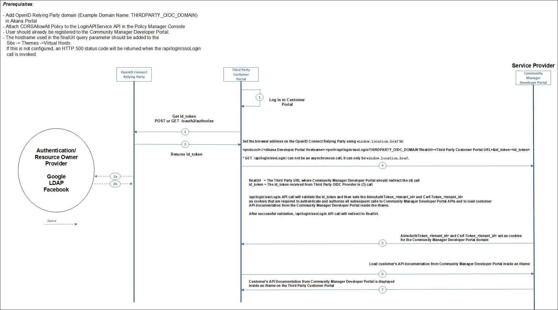
In the above:
- The domain name set up in the Community Manager developer portal (THIRDPARTY_OIDC_DOMAIN in this example), and the value used in the GET /api/login/ssoLogin API call as the value for the domain path parameter, must match.
- In the same API call, the value for the finalUrl query parameter is the URL for the page set up on the third-party portal, where users will access the API documentation.
Note: In version 2019.1.35 and later: You can implement custom user workflow to mark a third-party user, logging in for the first time, as a registered user. See @AllowMarkUserAsRegistered in the user workflow documentation.
Single sign-on with third-party portal using an OIDC provider: API call example
An example for the SSO login API call to the developer portal, with sample values is shown below.
Third-party OpenID Connect (OIDC) domain URL:
https://oidc.acmepaymentscorp.com
Domain name for the above third-party OIDC domain, as set up in the Community Manager developer portal:
THIRDPARTY_OIDC_DOMAIN
Third-party custom page for displaying the API documentation:
https://myportal.acmepaymentscorp.com/devportal_api_doc.html
Community Manager developer portal URL:
https://apiportal.acmepaymentscorp.com/#/home/landing
In this example, the API call would be (line break added for display purposes):
https://apiportal.acmepaymentscorp.com/api/login/ssologin/THIRDPARTY_OIDC_DOMAIN
?finalUrl=https://myportal.acmepaymentscorp.com/devportal_api_doc.html&id_token={id_token_value}
Rendering API documentation in a third-party portal: using the customization example
You can configure a third-party portal to display API documentation from the Community Manager developer portal, including Swagger documentation, OpenAPI documentation, and Test Client.
To do this:
- Follow the steps shown in the sequence diagram above Integrated login with a third-party portal: End-to-end sequence diagram. Be sure to complete the prerequisites. If needed, use the examples in Single sign-on with third-party portal using an OIDC provider: API call example to put together your API call.
The API call takes care of the authorization and authentication.
- Use the customization example provided with the product. The customization ZIP file includes a working example, with step-by-step instructions, all the files you need, and a sample HTML file for rendering the API documentation, with the applicable code in place. If you don't have the customization ZIP file, or don't have the latest version, contact Customer Support or your Akana representative..
The customization example helps you code the third-party portal page so that it displays the API documentation.
To use the customization example for rendering API documentation in a third-party portal
- Download and unzip the ZIP file.
- Go to the \test_client\external_portal folder.
- Copy those files to the thid-party portal.
- Follow the instructions in the \test_client\external_portal\readme.md file to update the placeholder values and apply any other changes you might want.